
By Catherine Austin Fitts
My “go to” website for technical analysis of precious metals, the US dollar & the US stock market is Rambus Chartology, where Rambus (that’s his handle – he’s the founding technical analyst) leads a discussion with extensive charts of what the markets are saying.
In January 2016, Rambus launched his quarterly Solari Report with a Blockbuster Chartology. You can find links to the entire series of quarterly and annual Blockbuster Chartologies at the end of this latest piece.
One of the reasons that Rambus is so good at his craft is that he focuses on “staying on the right side of the major trend.” The challenge of doing so at this time is that it is tempting to look for bottoms or to assume that the trend upwards in the US dollar or stock market may be over. However, Rambus consistently brings us back to the discipline of the Chartology. What does price tell us? As he describes so aptly, we are dealing with psychological warfare.
Sitting back once each quarter to get this perspective offers invaluable insight. So, here we go for the 2nd Quarter 2022 Wrap Up Blockbuster Chartology!
Blockbuster Chartology Quarterly Report
By Rambus
~ 2nd Quarter 2022 Wrap Up ~
US and World Stock Markets
PM Complex
US and World Stock Markets
There is one big question that hasn’t been answered completely yet. Is the correction that began at the January 2022 high the end of the secular bull market that began at the 2009 bear market low or just a correction in the ongoing secular bull market? I know what most investors are thinking right now so lets go to the charts and see if they can give us any good clues on the next important direction for the stock markets.
There is no doubt that since the beginning of this year the bears have been in total control of the stock markets. As this first weekly chart for the SPX shows, is that during a strong impulse move in a bull market the price action will make higher highs and higher lows as the rally out of the 2020 crash low shows and the one year rally out of the 2018 low.
Since the January high of this year you can see the SPX has made a series of lower lows and lower highs showing a downtrend. The SPX also built out a double H&S top reversal pattern that reached its minimum price objective on this weekly line chart at 3652 which brings up the first critical area of possible support. After reaching the previous low made earlier this year the SPX stalled out and had a small decline showing us the previous low is working as resistance similar to the initial breakout below NL2 which rallied back up to the neckline before the next leg down. The first real sign that the recent low could be an important low is if we see the SPX trade above the previous low at 3925.
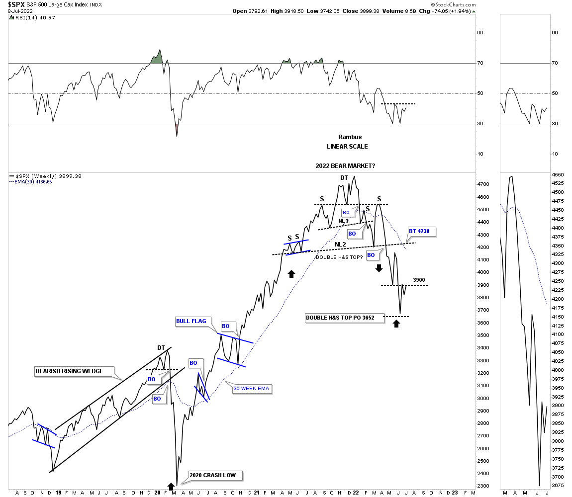
This weekly line combo chart chart for the US stock markets show the potential bearish setup using the H&S top as the reversal pattern. Even if the recent low is THE low there is still a lot of work that has to be done like trading above the 30 week ema which is moving lower.
And then there is the potential bullish outcome if the US stock markets are experiencing just a correction in the secular bull market. Since the January high of this year I can make a case for a bullish expanding falling wedge which would look like a small correction in the secular bull market if it indeed plays out. As you can see the SPX is currently trading between the blue 200 week sma which is still rising and the 30 week red ema which is declining. Again, there is a lot of work to be done by the bulls if this scenario is going to play out.
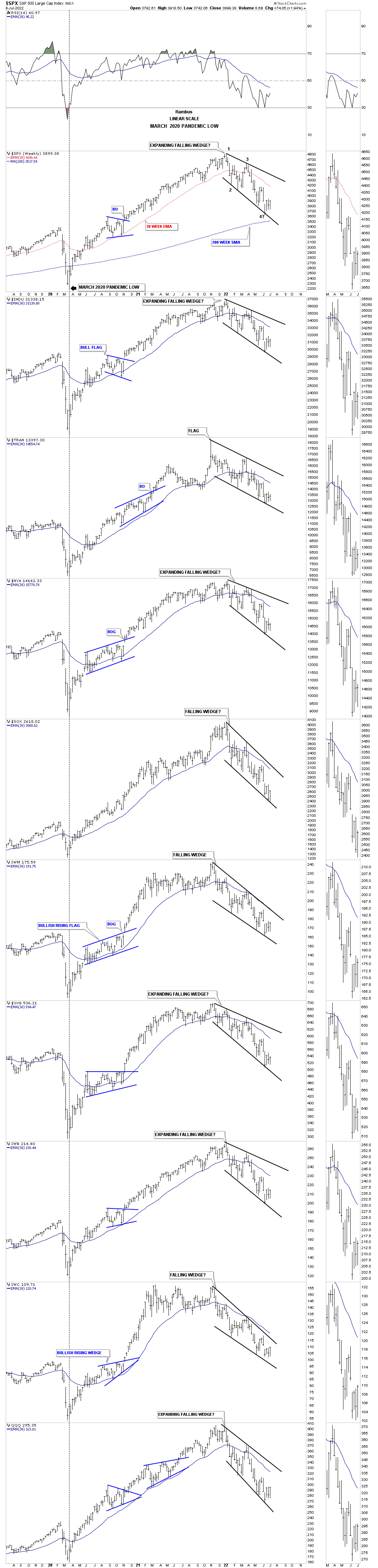
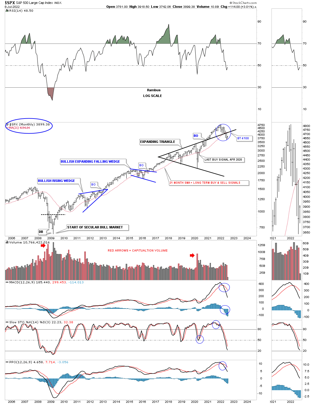
Next is a long term monthly chart for the SPX which shows the beginning of the secular bull market that began at the 2009 crash low and the two blue consolidation patterns with an impulse move between each one. In 2018 began the biggest consolidation period of the entire secular bull market which ended up being the black expanding triangle with the 2020 crash low the last reversal point.
Nothing was broken in regards to the 2018 black expanding triangle until May of this year when the price action closed below the top rail and the 21 month sma which I use for long term buy and sell signals. The 21 month sma will remain on a long term sell signal until the SPX can close a month above it which could take several years in some cases or a whip saw that could just a take a month or two as you can see in the previous impulse moves starting at the 2009 bear market low.
This next long term chart for the SPX shows the 2000 to 2013 consolidation pattern that was needed to correct the previous secular bull market that began at the 1974 low. What is a little disheartening was to see the SPX trade below the top rail of the expanding triangle which put the bears back in charge. In order to negate this negative setup is to see the SPX trade back above the top rail which would then be a false breakout to the downside which can lead to a big move in the opposite direction and in this case up. For now the bears are in charge.
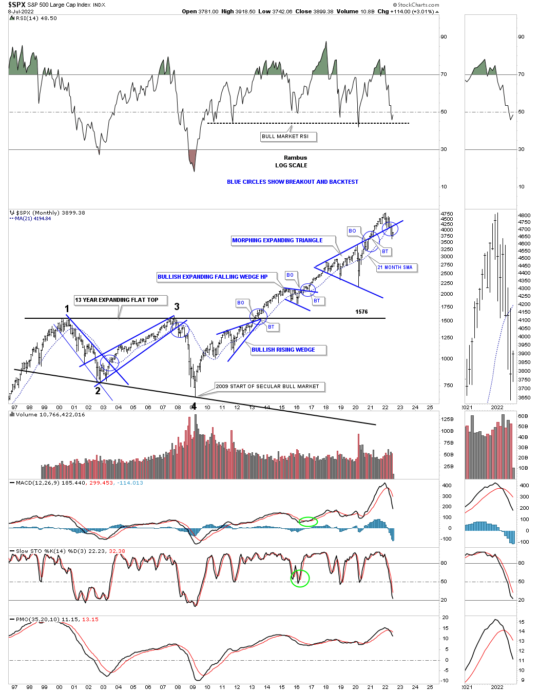
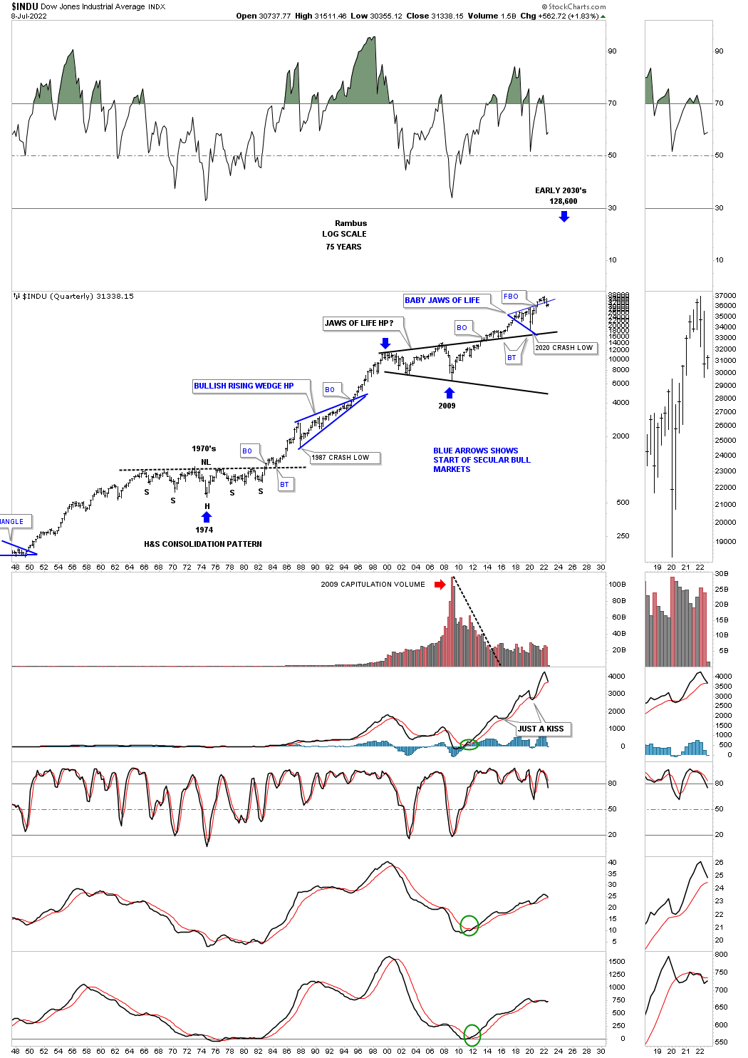
This last chart for the SPX shows the secular bull market that began at the 1974 low and ran for 26 years into the 2000 high. Note the blue bullish rising wedge which formed in the middle of that secular bull market that formed as a a halfway pattern.
Reversal point #4 in the 2013 flat top expanding triangle, we just looked at on the weekly chart above, shows the beginning of the current secular bull market that began in 2009. At this point the secular bull market, if indeed is still alive and well, is only about 13 years old or about half as old as the 1974 to 2000 secular bull market. It might seem like I’m grasping at straws still thinking the secular bull market could still be in tact, but we’ve had several corrections so far since the 2009 low that seemed like they could have been the end of the secular bull market, but proved wrong.
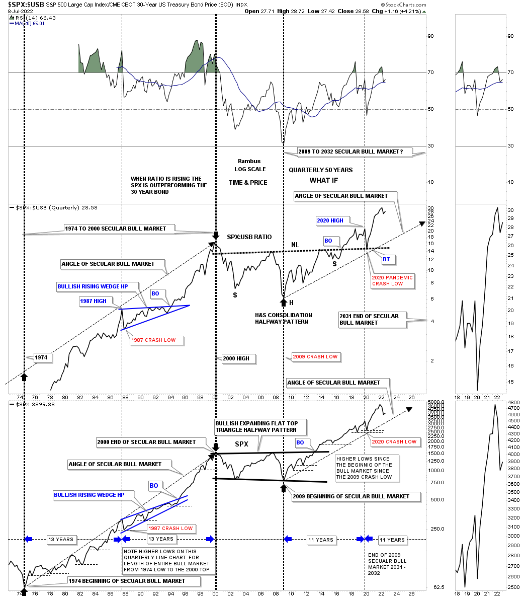
This next chart is a long term quarterly ratio combo ratio chart which compares the $SPX:$USB ratio on top to the SPX on the bottom. As you can see the ratio chart on top is confirming the secular bull markets, the 1974 to 2000 secular bull market and our current secular bull market that began at the 2009 crash low. Note the massive H&S consolidation pattern that formed on the ratio chart which you can compare to the 2013 flat top expanding triangle on the SPX. Since the 2020 crash low both have been making new all time highs which is what you would expect if the secular bull market is alive and well. There is a lot of other important information on this ratio combo chart if you take a few minutes to study the information in more detail.
This long term monthly chart for the INDU shows its massive consolidation pattern that began forming at the 2000 high which I’ve been calling the, Jaws of Life, since the breakout above the top rail because so many analysts were calling it the, Jaws of Death, and how it was going to usher in the end of the world as we knew it.
Here again you can see how the INDU has traded back below the top rail of its, Baby Jaws of Life, just like so many other US stock market indexes. Note where the 2020 crash finally found support which felt like the end of the world before the reversal off the top rail extension line.
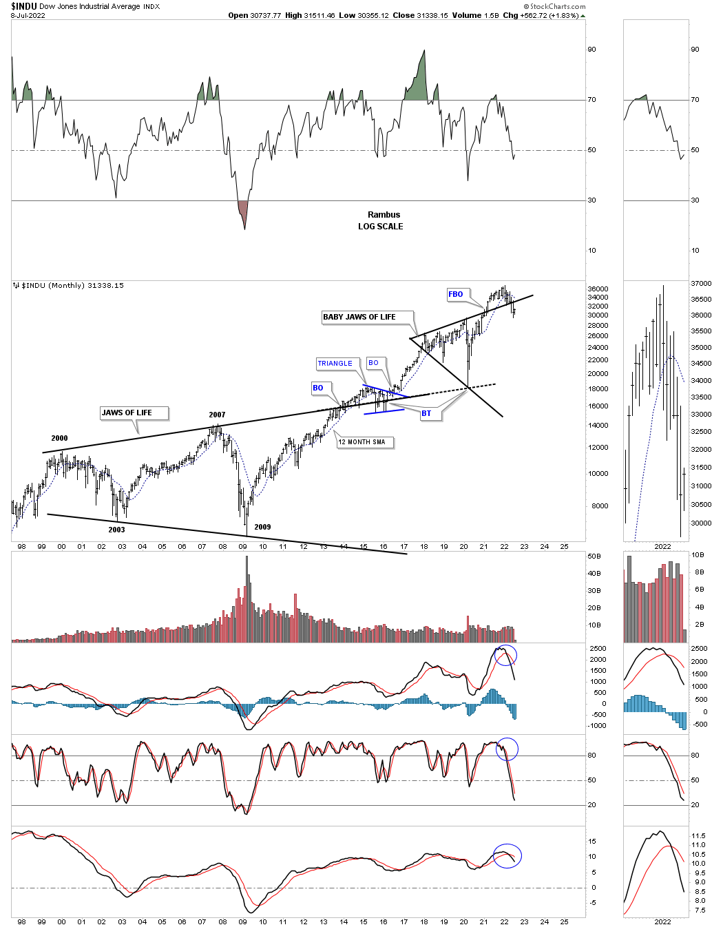
This quarterly chart for the INDU shows its 1974 secular bull market and the current secular bull market that began at the 2009 low if what we are experiencing right now is not the end of the world as so many are predicting.
This monthly chart for the Transportation Average shows the main theme right now with the top rail of the very large consolidation pattern giving way to the downside.
This 100 year quarterly chart for the Transportation Average shows some beautiful Chartology through the years. Note the massive bullish expanding rising wedge that built out over multiple decades which shows a similar false breakout to the downside before moving higher.
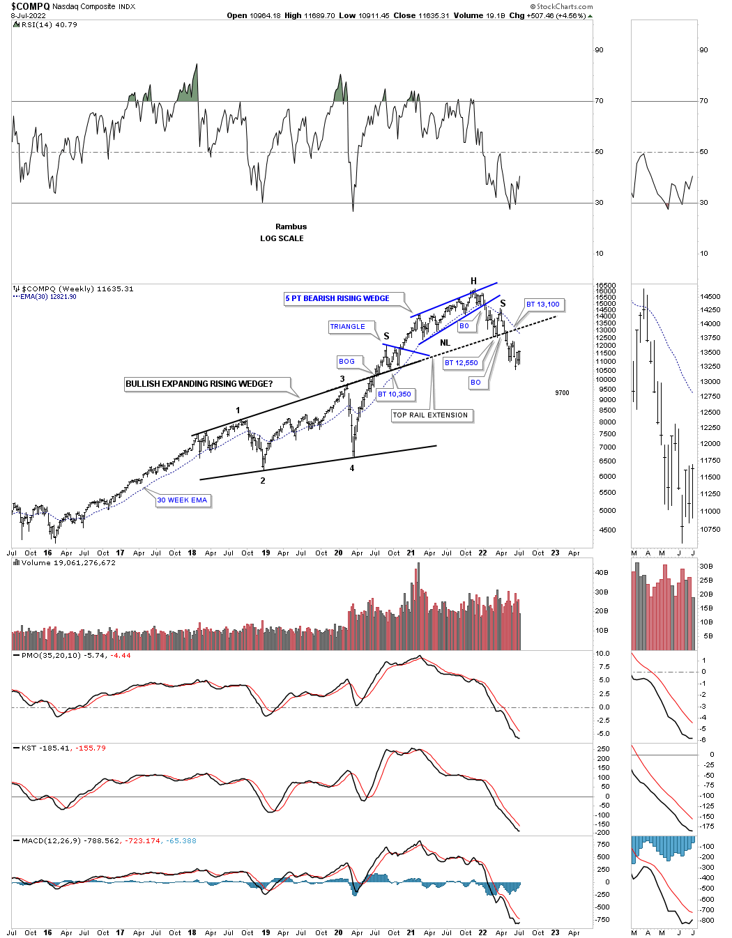
Next is a weekly chart for the COMPQ which I have to admit looks pretty bearish right now. After breaking out from the black bullish expanding rising wedge the COMPQ formed the 5 point blue bearish rising wedge which was the first clue that a correction was underway when the bottom rail gave way. Then the top rail of the black expanding rising wedge, top rail extension, gave way that showed a H&S top. If the bulls are going to succeed the first thing they will need to do is form a higher high and a higher low to reverse the downtrend.
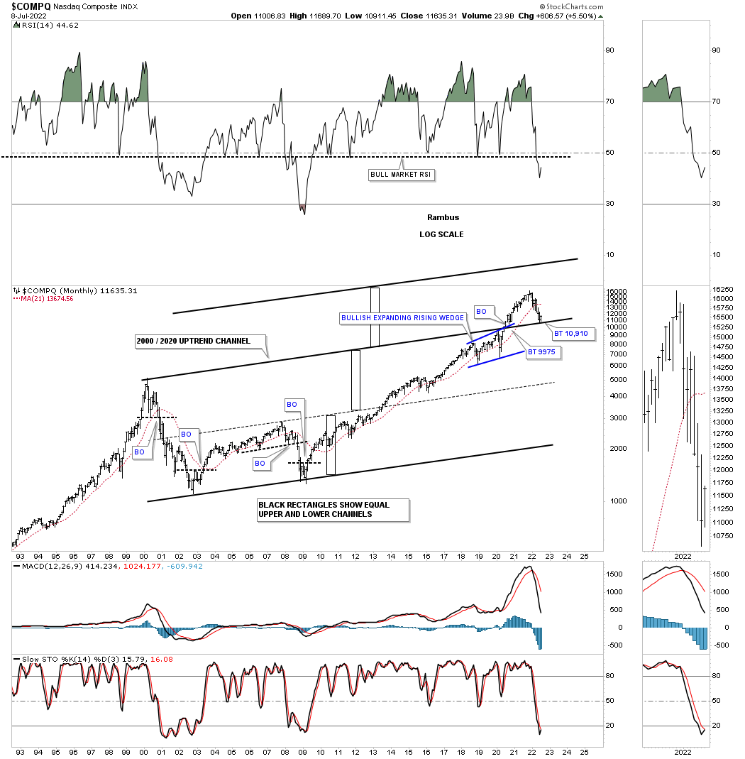
This is one for the bulls if they can hold on to the top rail as support. Through the years I’ve seen what looked like a normal uptrend channel morph into a bigger uptrend channel by doubling the size of the lower channel, black rectangles. I’ve even seen a third equal channel form.
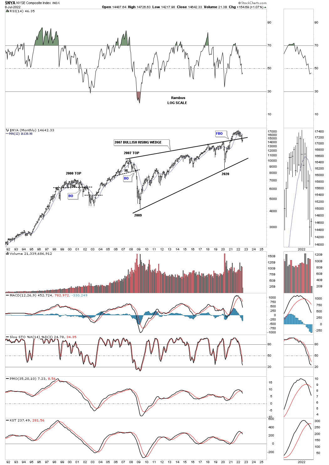
The NYA is set up a bit differently than most of the other US stock market indexes as it just recently broke out above the top rail of its 2007 rising wedge, but is showing the same characteristics with a false breakout above the top rail so far.
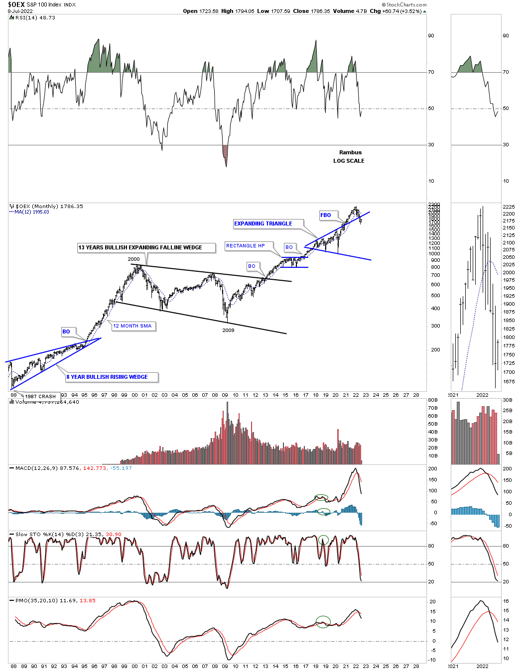
The OEX 100 same false breakout.
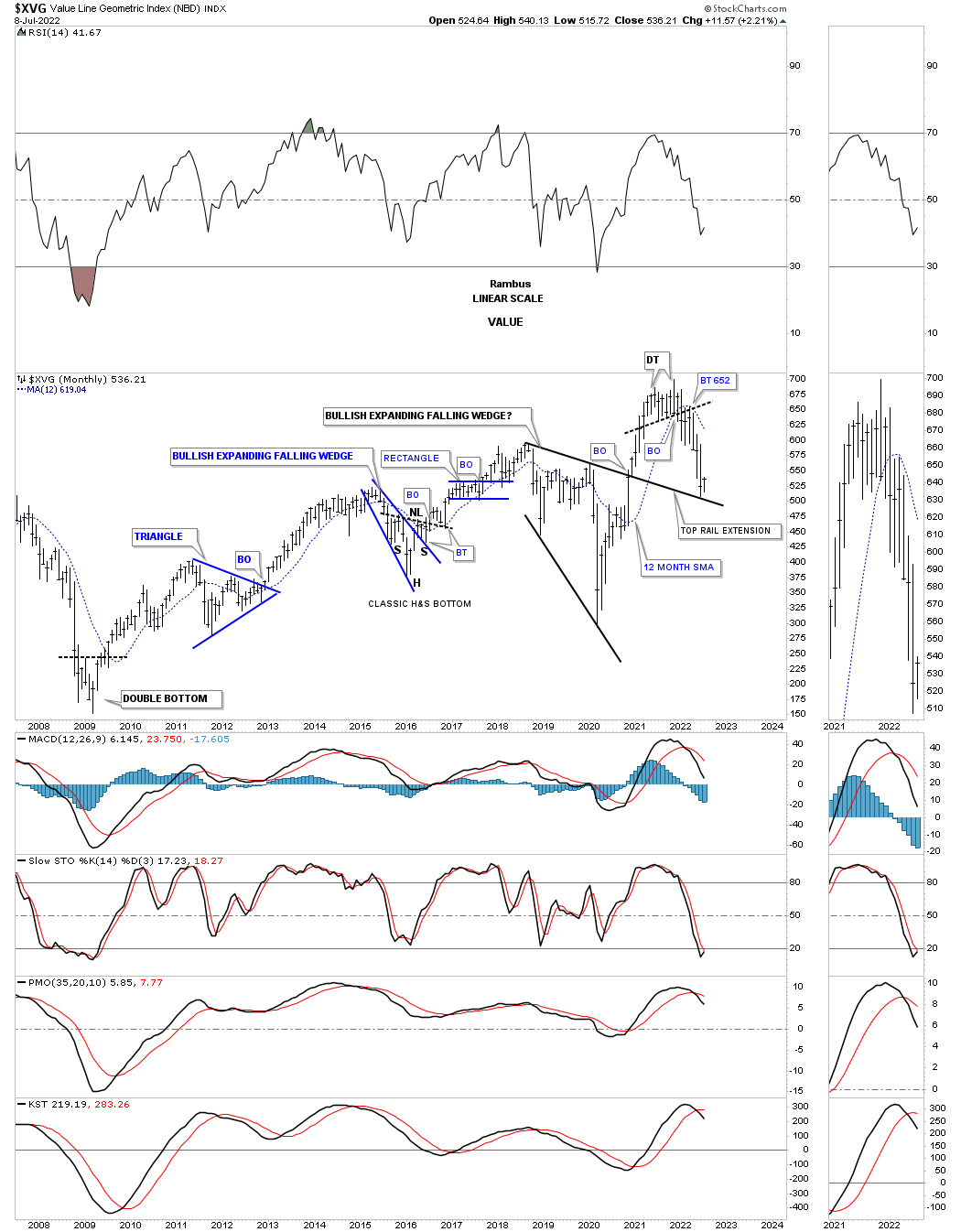
The XVG found initial support on the top rail of its bullish expanding falling wedge in June.
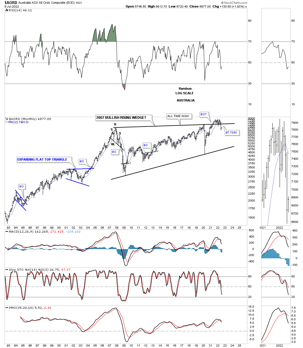
Now lets look at some stock markets from around the world starting with the AORD, Australian stock market, that fairly recently broke out from it massive rising wedge formation which is showing a false breakout at the moment.
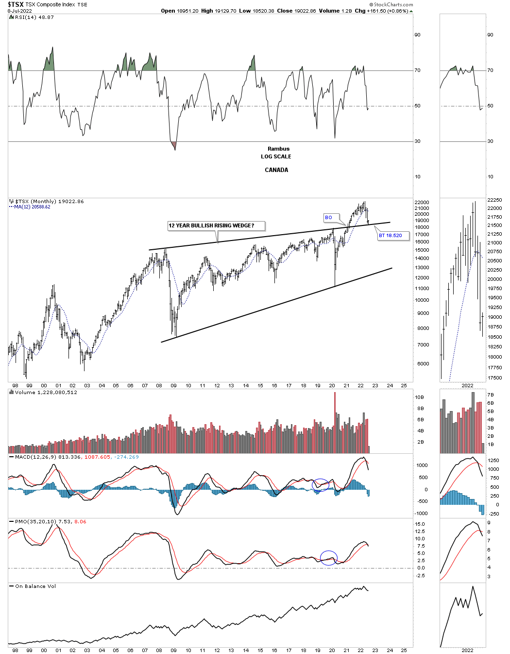
The TSX, Canadian stock market, broke out of its rising wedge formation in early 2021, but it is one of the few stock markets that is actually finding support on the backtest so far.
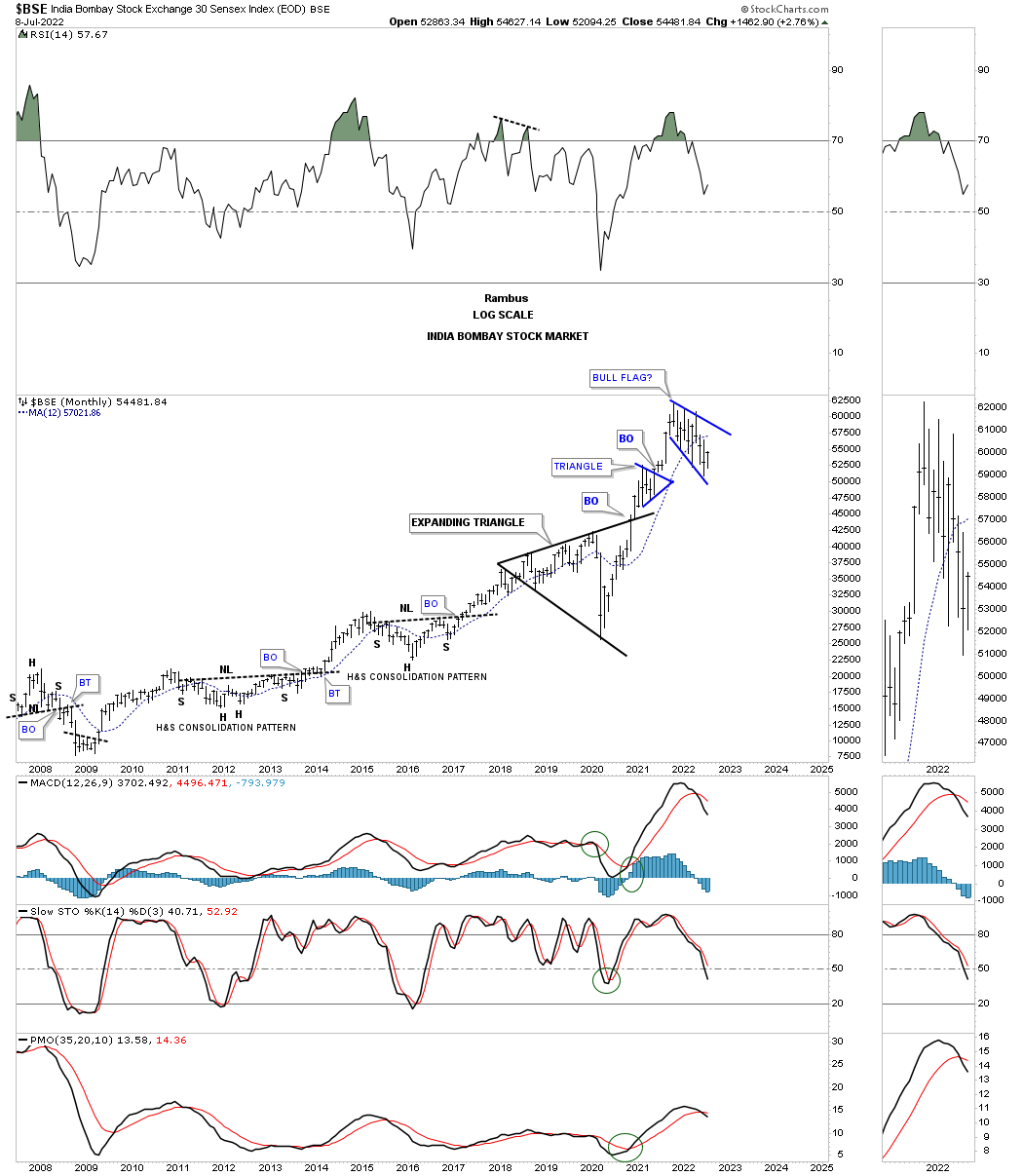
The BSE, India stock market, is forming a possible bull flag if the bottom rail can hold support.
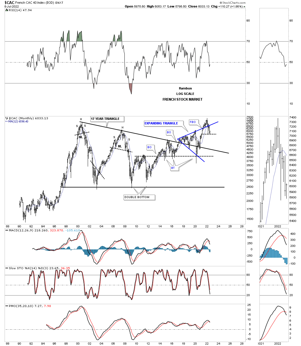
The CAC, French stock market, shows a false breakout above the top rail of its expanding triangle. If you look at the thumbnail on the right sidebar you can see a possible double bottom setting up if this low can hold.
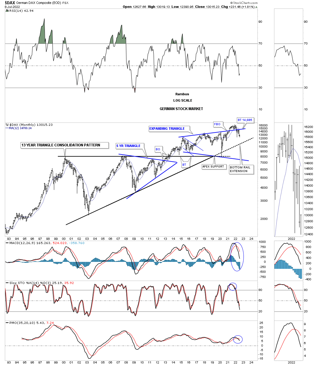
The DAX, Germany stock market, shows the same setup as most of the stock markets around the world with a false breakout above the top rail of its expanding triangle. It too could be forming a possible double bottom if the current low holds support.
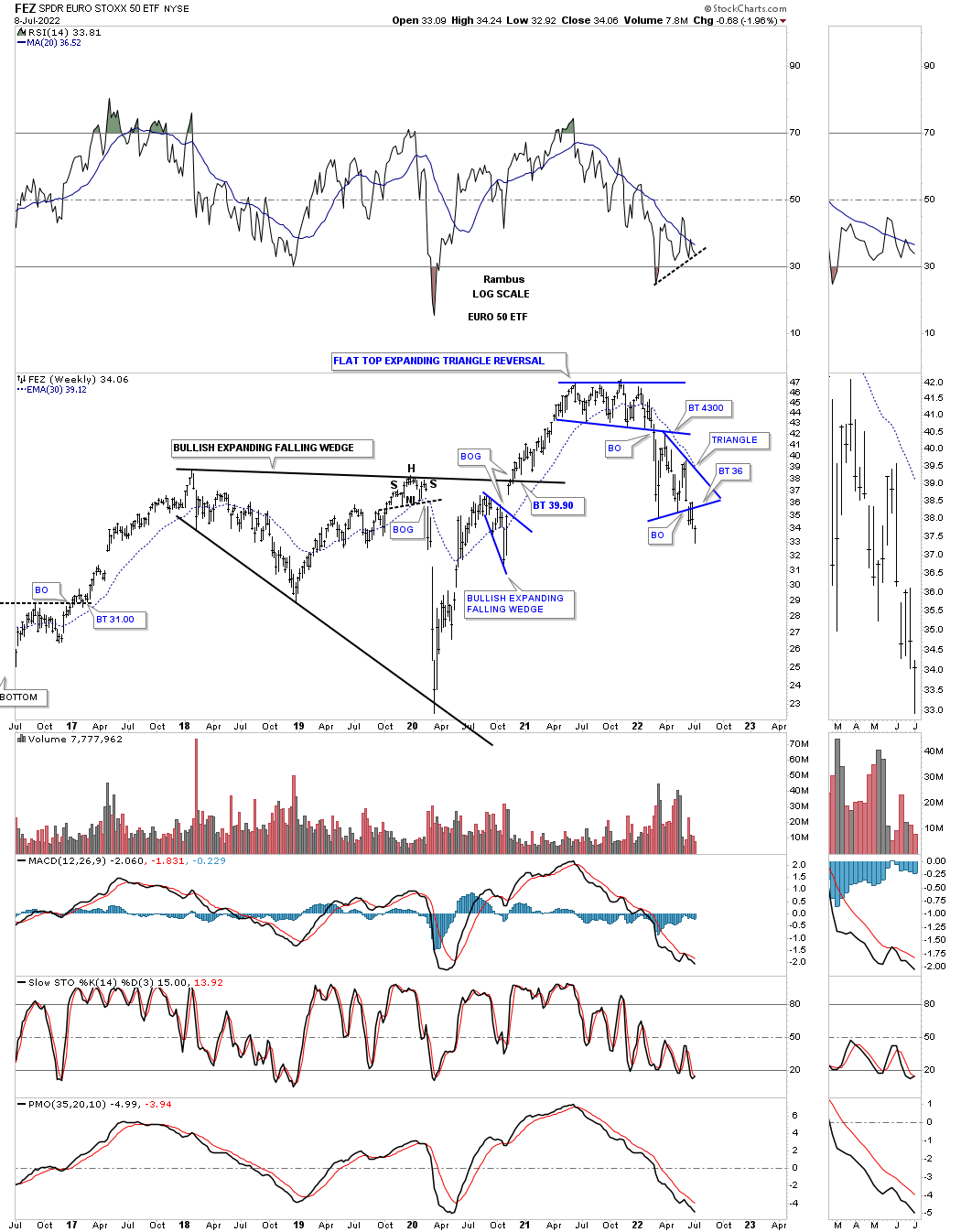
This next chart is weekly look at the FEZ, euro 50 etf, which looks pretty bearish after recently breaking down from the blue triangle with a backtest to the bottom rail in place.
Next is the NIKK, Tokyo stock market. which is finding resistance at the top of its expanding rising wedge. A breakout above the top rail would be very bullish, but a breakout below the bottom rail would be very bearish as the 4th reversal point is now complete.

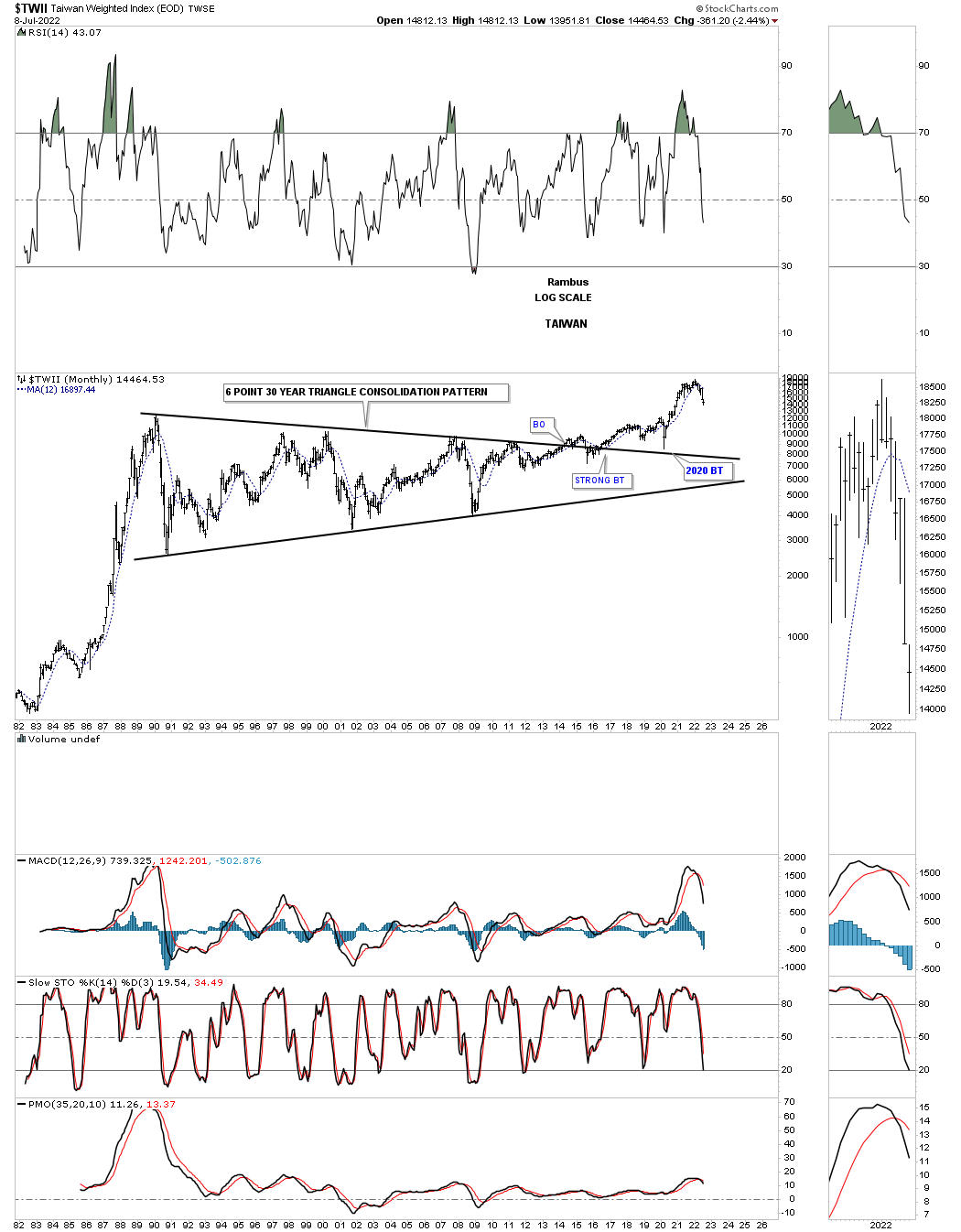
TWII, Taiwan stock market, built out a 26 year bullish triangle which is the longest in time that I’ve ever seen. The 2020 crash low found support on the top rail.
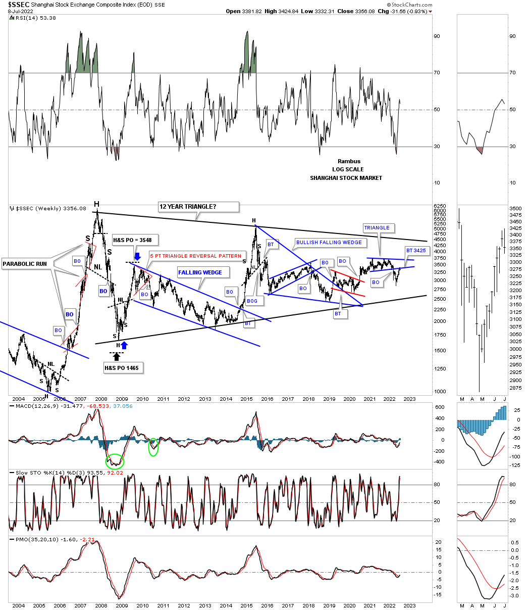
SSEC, Shanghai stock market, is currently backtesting the bottom rail of its blue triangle within the massive triangle that began forming after the parabolic rise in 2007. As you can see a parabolic rise usually doesn’t end very well.
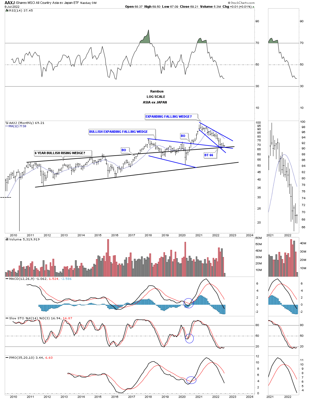
The AAXJ is an Asia etf ex the Japan stock market, which is currently backtesting the three trendlines. The longest one is the top rail of the black bullish rising wedge, the top rail of the blue 2018 bullish expanding falling wedge and the most recent expanding falling wedge. To say this is a critical backtest in an understatement.
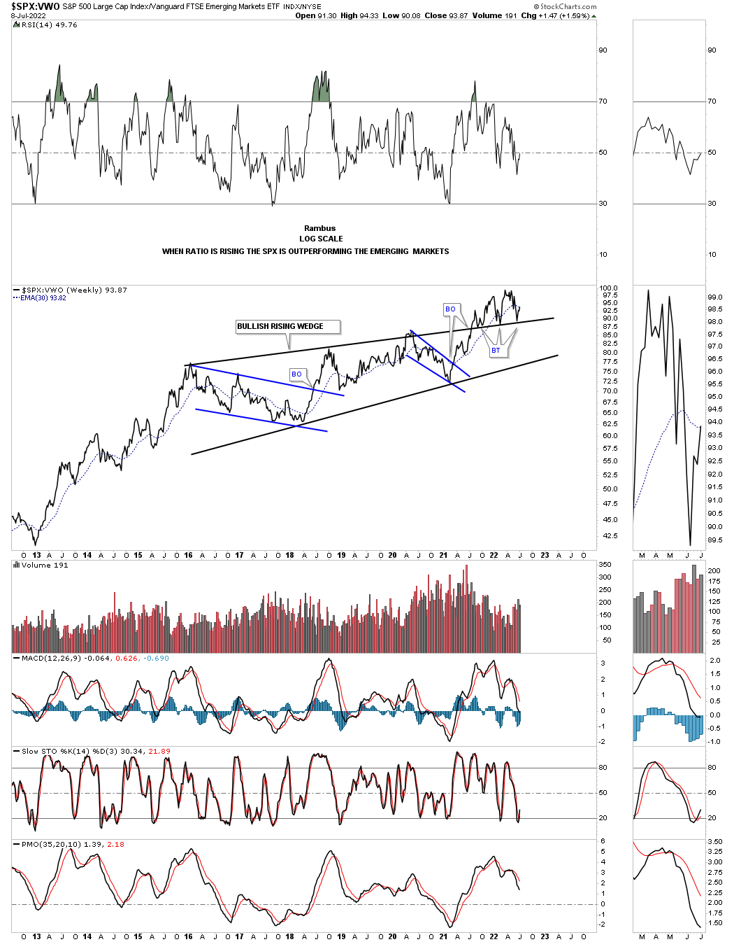
How is the US stock markets doing against the rest of the world? Below is a ratio chart which compares the SPX to the VWO, emerging markets. This ratio started building out the bullish rising wedge back in 2016 with the price action breaking out in 2021 with three distinct backtests to the top rail. If the top rail can hold support the SPX should outperform the emerging markets for years to come.
This next ratio chart compares the SPX to the VEU, world stock markets ex the US. Here again you can see the SPX is really outperforming the rest of the world. Note the 2 small double bottoms that make up the bottom rail of the possible rising flag formation that would lead to the next impulse move higher if the top rail gives way.
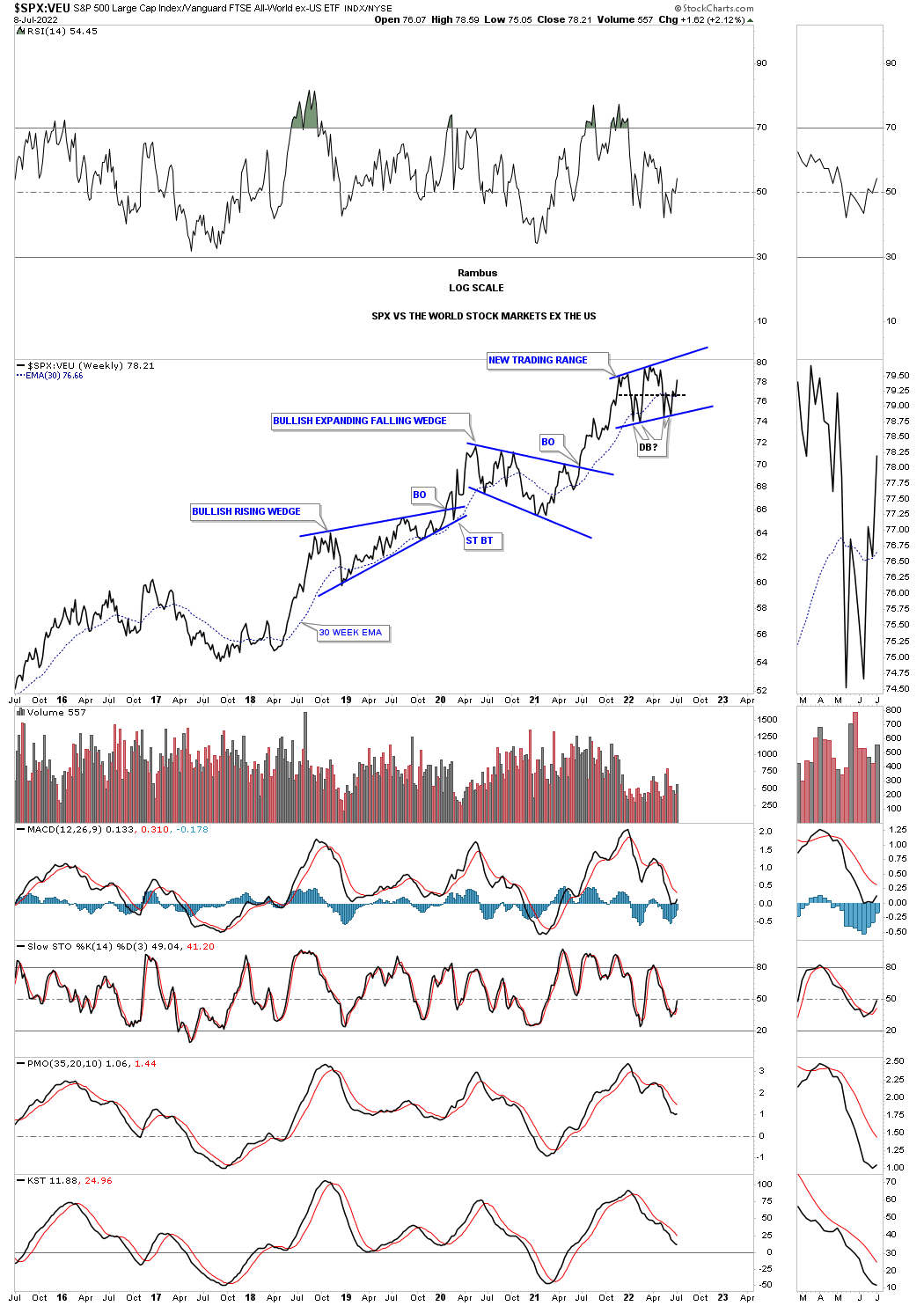
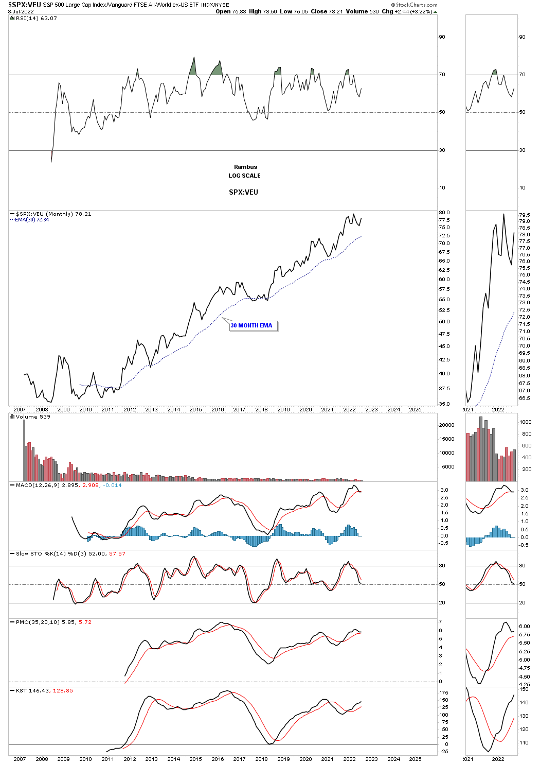
This last chart for tonight is the history chart for the SPX:VEU ratio going all the way back to 2007 which shows how the SPX has outperformed the rest of the world in a not so subtle way.
The bottom line is that most of the stock markets from around the world, including the US stock market, are at a make or break point. Most are showing a well defined expanding triangle which is currently showing a false breakout above the top rail. If we are experiencing the end of the world as we know it right now the bear market will gain momentum to the downside trapping everyone that hasn’t sold their stocks yet, trapped.
On the other hand if the secular bull market is still intact then we are just experiencing a cyclical bear market within a secular bull market and all will be right with the world once again when the dust settles. For the time being preservation of capital is paramount. All the best…Rambus
PM Complex
My job is to give you the best unbiased opinion of the markets to the best of my ability. That means my opinion is my opinion and not someone else’s. Opinions are a dime a dozen when it comes to the markets including mine. There are some good analysts and some not so good market analyst which can become very confusing when one tries to read every stock market timer on the planet.
Most investor will gravitate to someone that says what they want to hear to reenforce what they think the markets should be doing. Keeping an open mind can be very hard when so much information is bombarding us each and everyday of our life especially in this day and age. Information overload can cause mental paralysis which can lead to unwanted mistakes.
The most important thing to have when trading the markets, which is the toughest game on the planet to win, is to have a game plan and the discipline to execute it. It all sounds so easy on paper, but in reality it is much harder to do because we are human beings who have survived by following the herd.
The markets are like a casino in Las Vegas, sometimes you win and sometimes you lose, but in the end they will end up with most of your money. In the markets you may get some good trades off, but eventually you will give your profits back and then some until you realize this game we choose to play is much harder than you thought. I’ve said this many times in the past, “we are going up against the greatest traders and trading systems in the world that want every penny you have and won’t feel bad if it is your “LAST PENNY.”
I’m going to focus exclusively on the PM complex tonight and lay out the groundwork for what is possible if one can keep an open mind. There are never any 100% guarantees when it comes to the markets, but if we can get the odds in our favor we have a fighting chance to be successful. When looking at the charts below please keep an open mind.
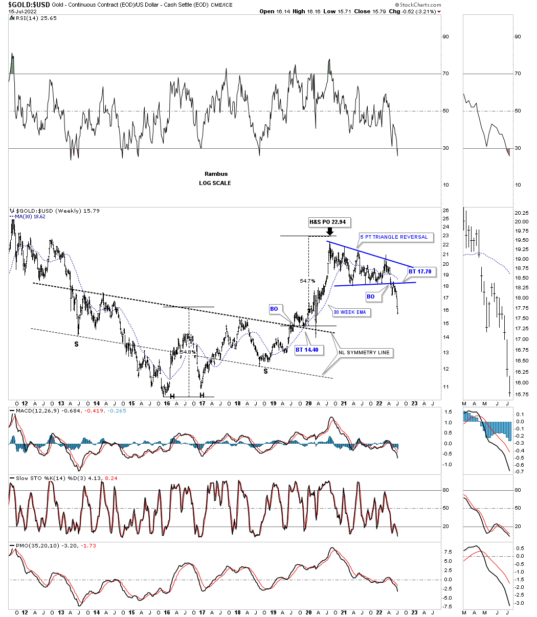
Many of the charts you will see were down loaded last Thursday, end of July, which was the end of the month and end of the quarter with a few downloaded this weekend. Lets start with the long term monthly chart for Gold which shows the possible double H&S bottom with the right shoulder still under construction. If you look at the thumbnail on the right sidebar you will see that Gold closed the month of June just below the 20 month ema for the first time since neckline1 gave way. It was only by a small margin which doesn’t look that significant, but it was the first time in a couple of years.
The best way to understand the importance of the 20 month ema is to start at the beginning of the bull market back in 2000 by following the price action and the 20 month ema together. The only time that Gold closed below the 20 month ema was during the 2008 crash which ended up being the head of the H&S consolidation pattern and only lasted one month. The very next month Gold closed back above the 20 month ema and stayed above the 20 month ema until the top completed at the 2011 high. It is all about where Gold closes at the end of the month and not what it does during the month. For now this is a warning sign.
July 4th:
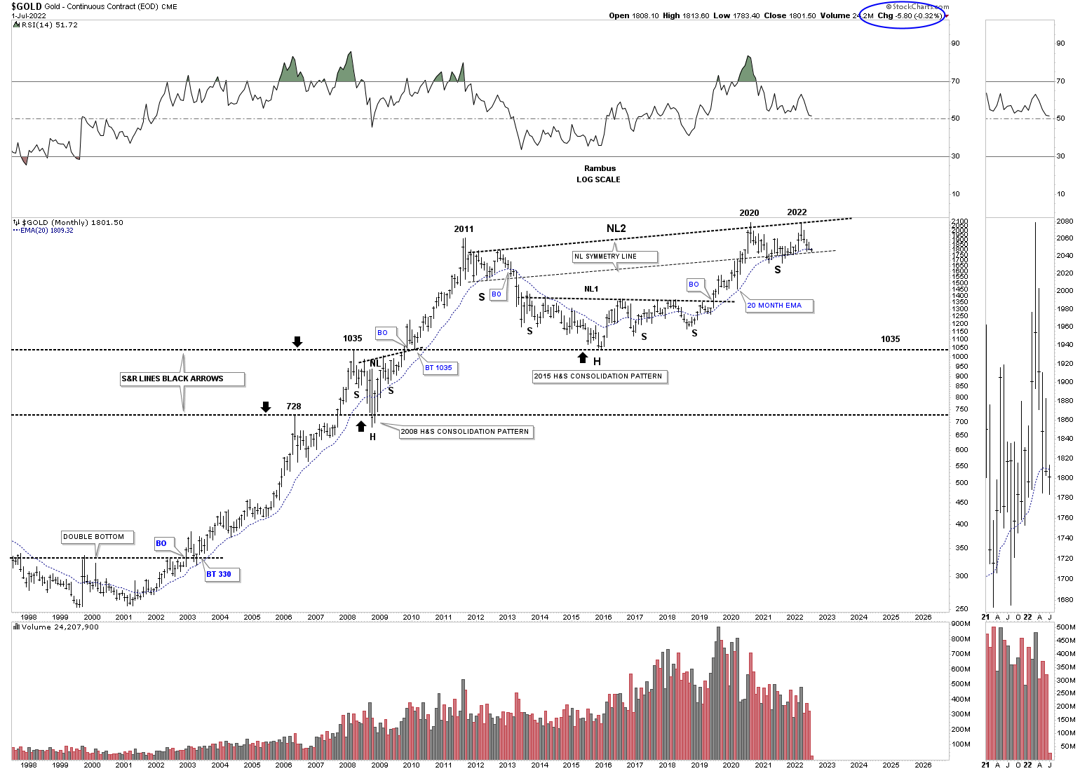
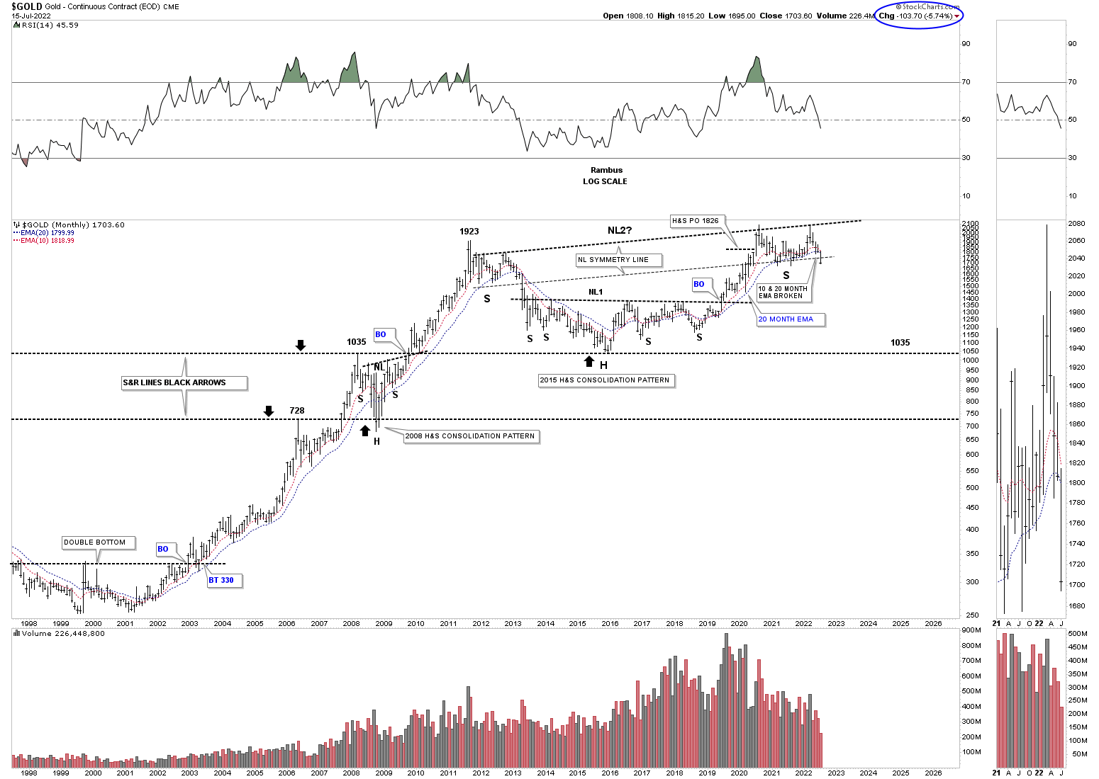
July 17th: The 10 & 20 month ema’s have been broken to the downside.
July 4th:
Next is the Gold fractal chart which shows the 2011 and 2020 trading ranges which are very similar in time and price. It is not the end of the world, but Gold was supposed to breakout one way or the other at the end of June and didn’t, calling the fractal into question. Again, it is not the end of the world just a warning sign.

July 17th: Now testing the bottom of the 2020 trading range.
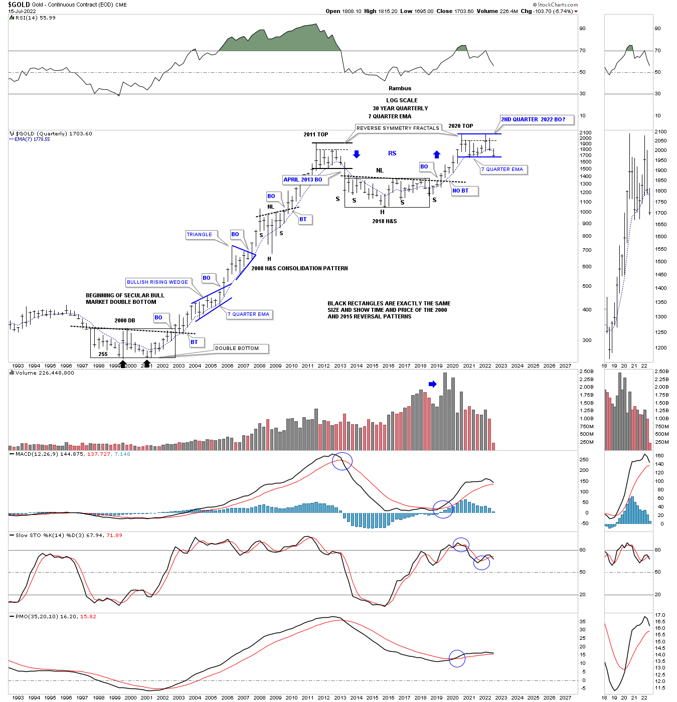
Keeping an open mind this weekly chart shows how Gold could still be in a bull market, but could have one more leg down to the bottom rail of a very large rising wedge formation that began forming at the 2011 high. Currently Gold is in no mans land offering no low risk entry point from this long term perspective.
July 4th:
July 17th: Now testing the bottom of the 2020 trading range.
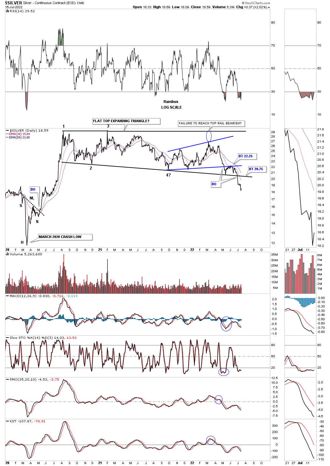
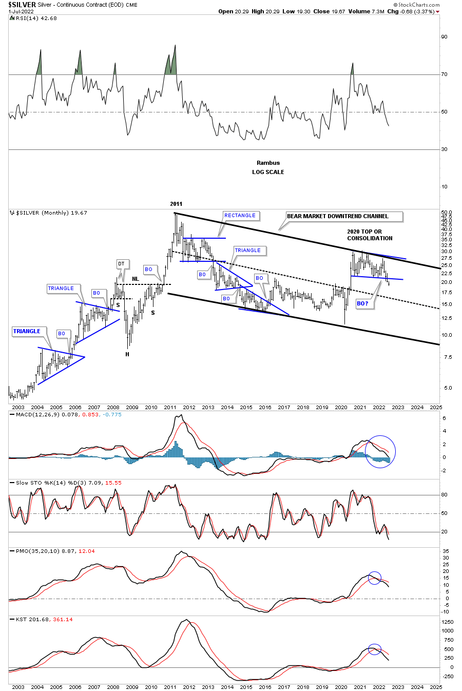
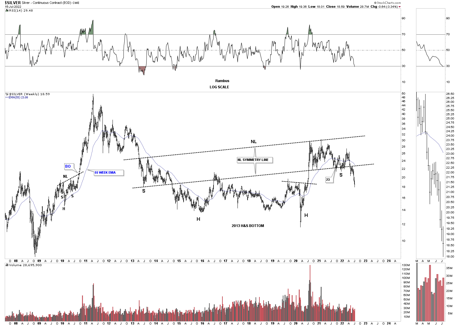
Lets move on to Silver which we know has been one of the laggards in the PM complex. After topping out in 2020 like everything else in the PM complex Silver has formed a flat top expanding triangle which gave way to the downside last week. Before breaking the bottom rail of the flat top expanding triangle, Silver put in the blue bearish expanding rising wedge which experienced a breakout and backtest to the bottom rail which strongly suggested the bottom rail of the 2020 trading range was going to give way. The blue circle shows weakness when Silver couldn’t rally all the way back to the top rail. We shouldn’t be surprised to see a backtest to the bottom rail of the flat top expanding triangle before the impulse move really takes hold to the downside.
July 4th:
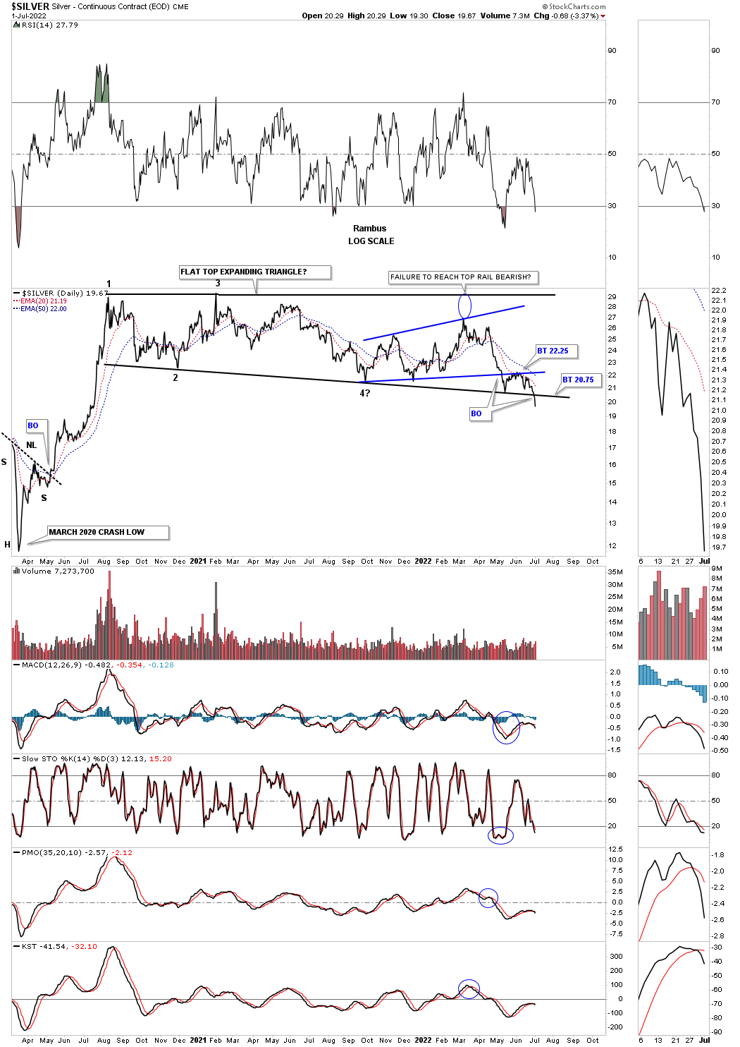
July 17th daily: Continues lower with no backtest yet.
This next chart is an old chart I used during the bull market years charting the bull market in Silver. It is hard to see now but during each impulse move the price action would form a small red bullish rising wedge between each consolidation pattern.
Now look at the top rail of the 2011 falling wedge and how nicely the 2020 trading range, on the daily chart above, interacts with it. As you can see there is no gap at the 5th reversal point as the angle of the top rail takes care of it now. You can see last weeks bar traded the entire week below the bottom rail. Again, we should expect to see a backtest.
July 4th:
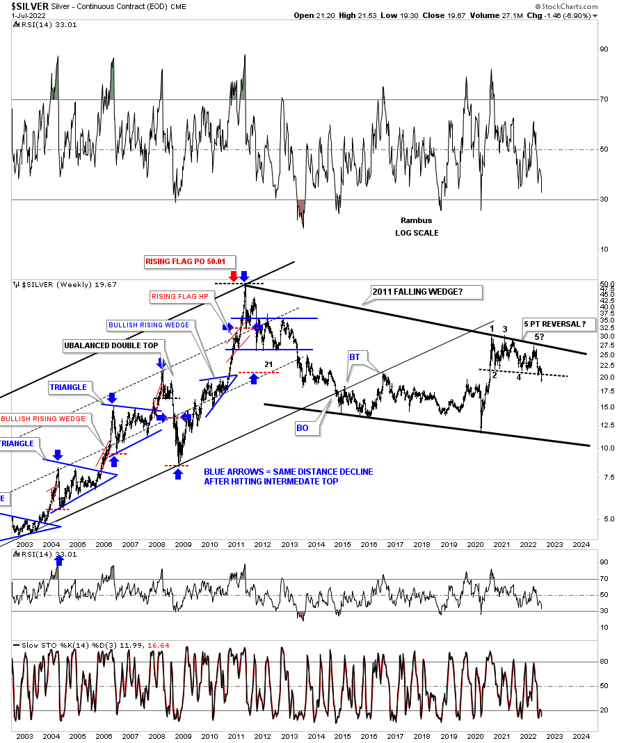
July 17th: Backtest or no backtest?
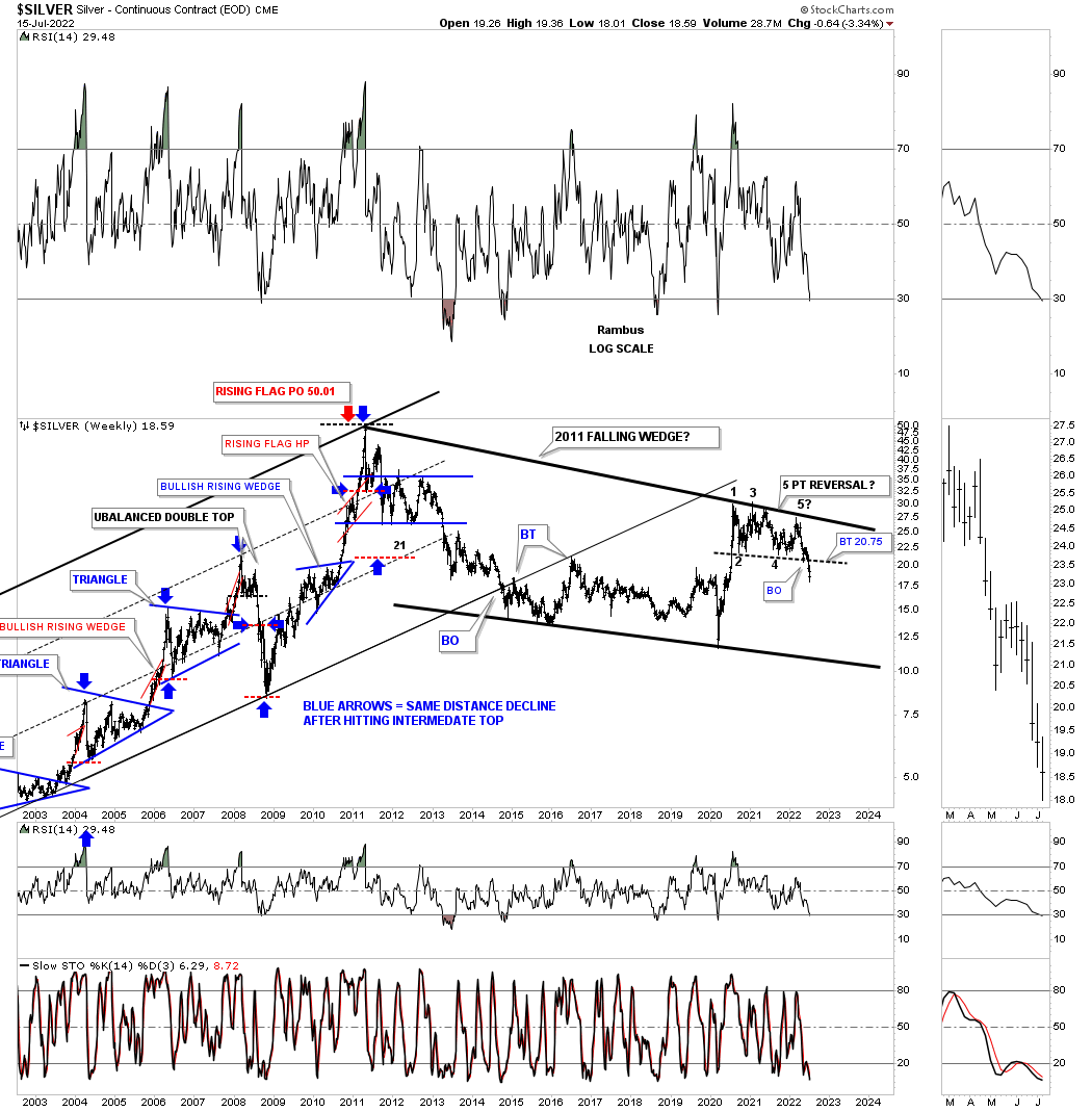
This slightly different version of the chart above shows the 2013 rectangle which was the first consolidation pattern in the 2011 bear market. Now look at the 2020 trading range and the similarity to the 2011 trading range. From strictly a support and resistance perspective you can see how the 2020 trading range has ran into resistance at the bottom of the 2013 trading range with just a bit of overlap. You can also see how the top of the 2016 trading range has been holding support. With Silver breaking below the bottom of its 2020 trading range the odds favor Silver moving lower leaving the 2020 trading range as a distribution pattern.
July 4th:
July 17th:

I realize that few can grasp what this big picture of Silver is strongly suggesting, but when the bottom rail of the 2020 trading range gave way the odds went way up that the top rail of the 2011 bear market downtrend channel is still hot and to be respected. The bulls had every chance in the world to hold support at the bottom blue rail, but they told us they are weaker than many think is possible.
July 4th:
July 17th: Breakout holds.
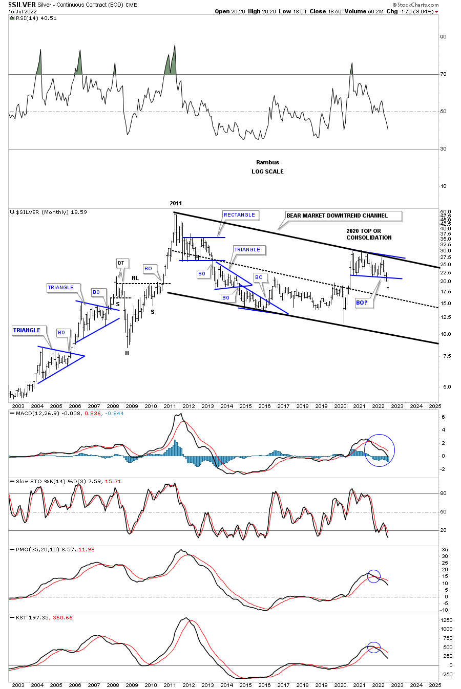
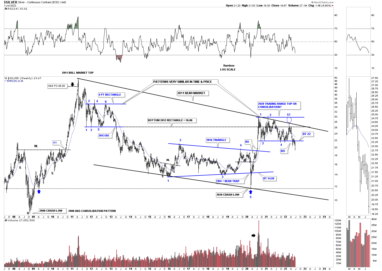
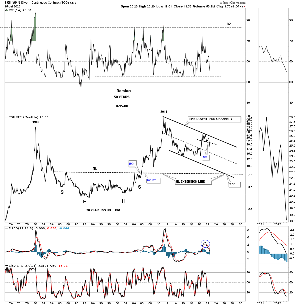
This 50 year monthly chart for Silver puts the 2011 downtrend channel in perspective. I know it seems impossible at this time, but the bulls are doing nothing to change this possible scenario. Until they do, it is what it is until it isn’t.
July 4th:
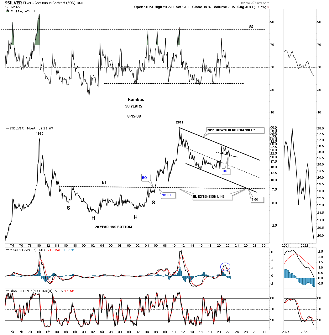
July 17th: No bulls yet.
About ten months or so ago I showed this chart for Silver and the rest of the PM complex which were forming a possible massive H&S base with the neckline symmetry line holding support for the low of the right shoulder. As you can see that possible H&S bottom is fading fast as the price action is now trading below the neckline symmetry line which isn’t the end of the world of the possible H&S bottom, but it now puts it in question. It is not pretty and symmetrical anymore.
July 4th:

July 17th: All we got was a backtest to the NL symmetry line.
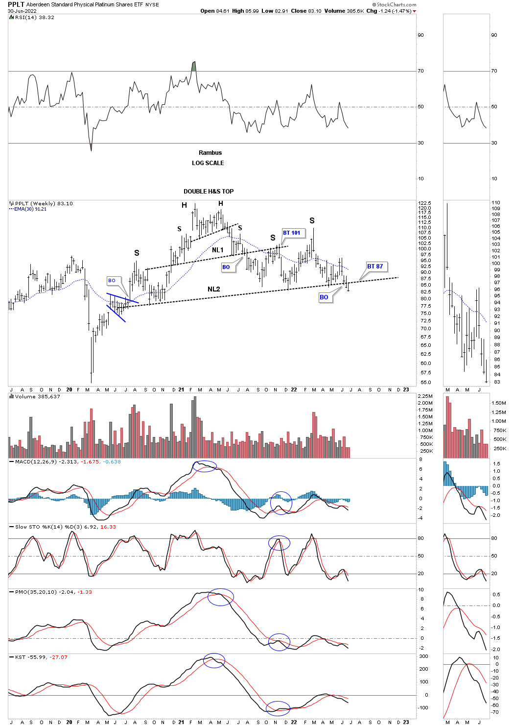
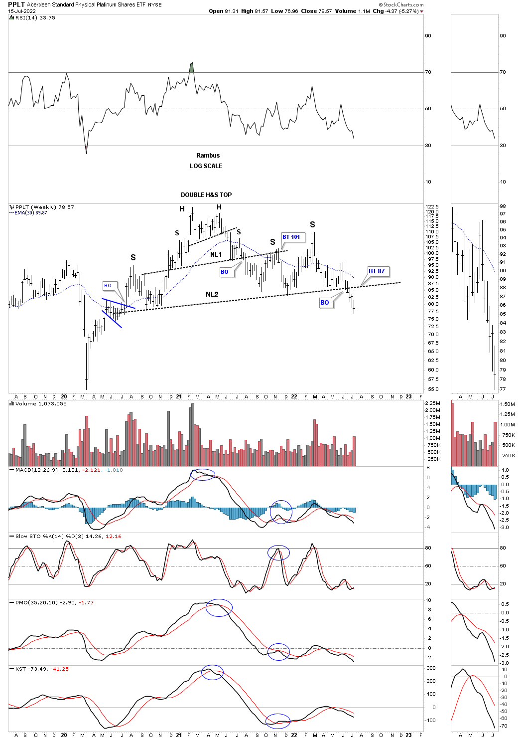
PPLT: Platinum, has now traded two weeks below its possible very large H&S top neckline. Now we’ll watch the neckline for a backtest to see what happens.
July 17th: The breakout continues with no backtest yet?
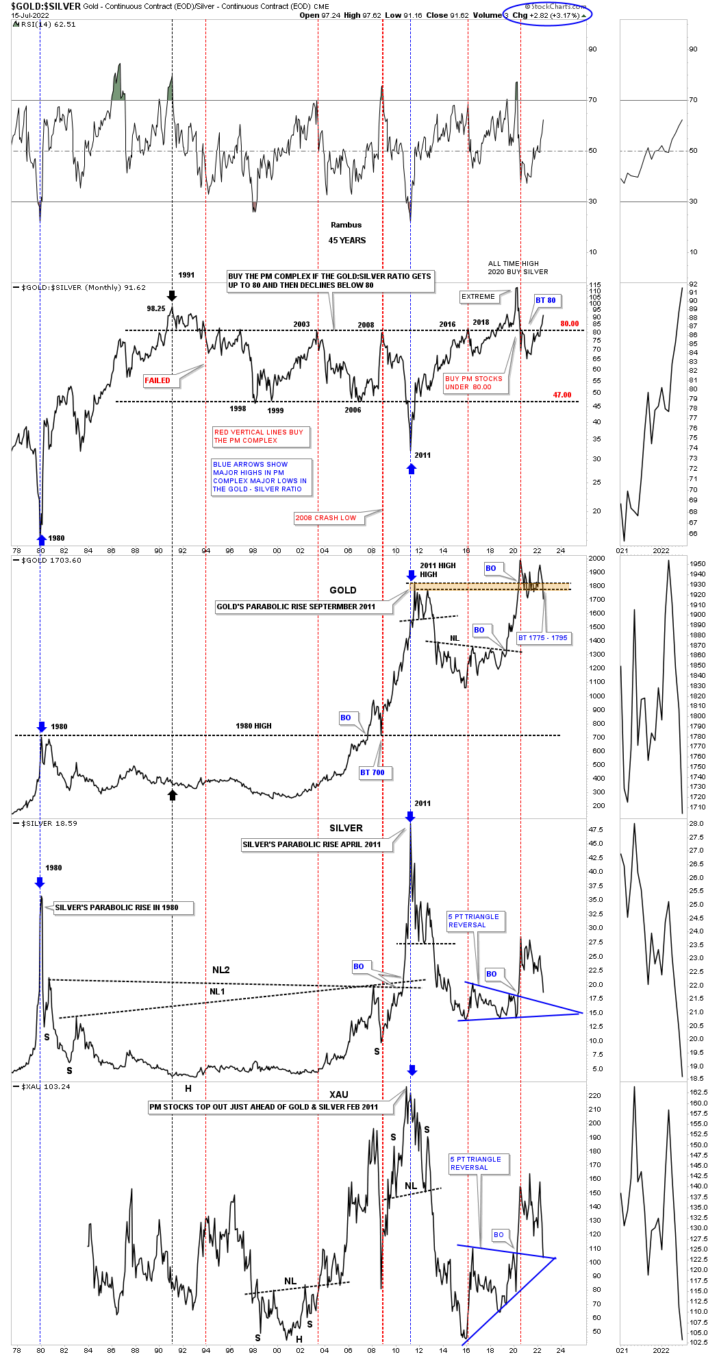
Now lets look at a couple of ratio charts to see if they can help us in determining the next important move in the PM complex. This first ratio chart compares Gold to the US dollar which shows the ratio built out a very large H&S bottom, meaning Gold was outperforming the US dollar into the 2020 high. As you can see the price action fell just shy of reaching the minimum price objective for the H&S bottom.
Since the high made in 2020 the ratio formed the five point blue triangle reversal pattern that shows a breakout and backtest that may be complete. I don’t want to sound like a broken record, but if the Gold bulls were in charge the triangle should have broken to the upside and not the downside.
July 4th:
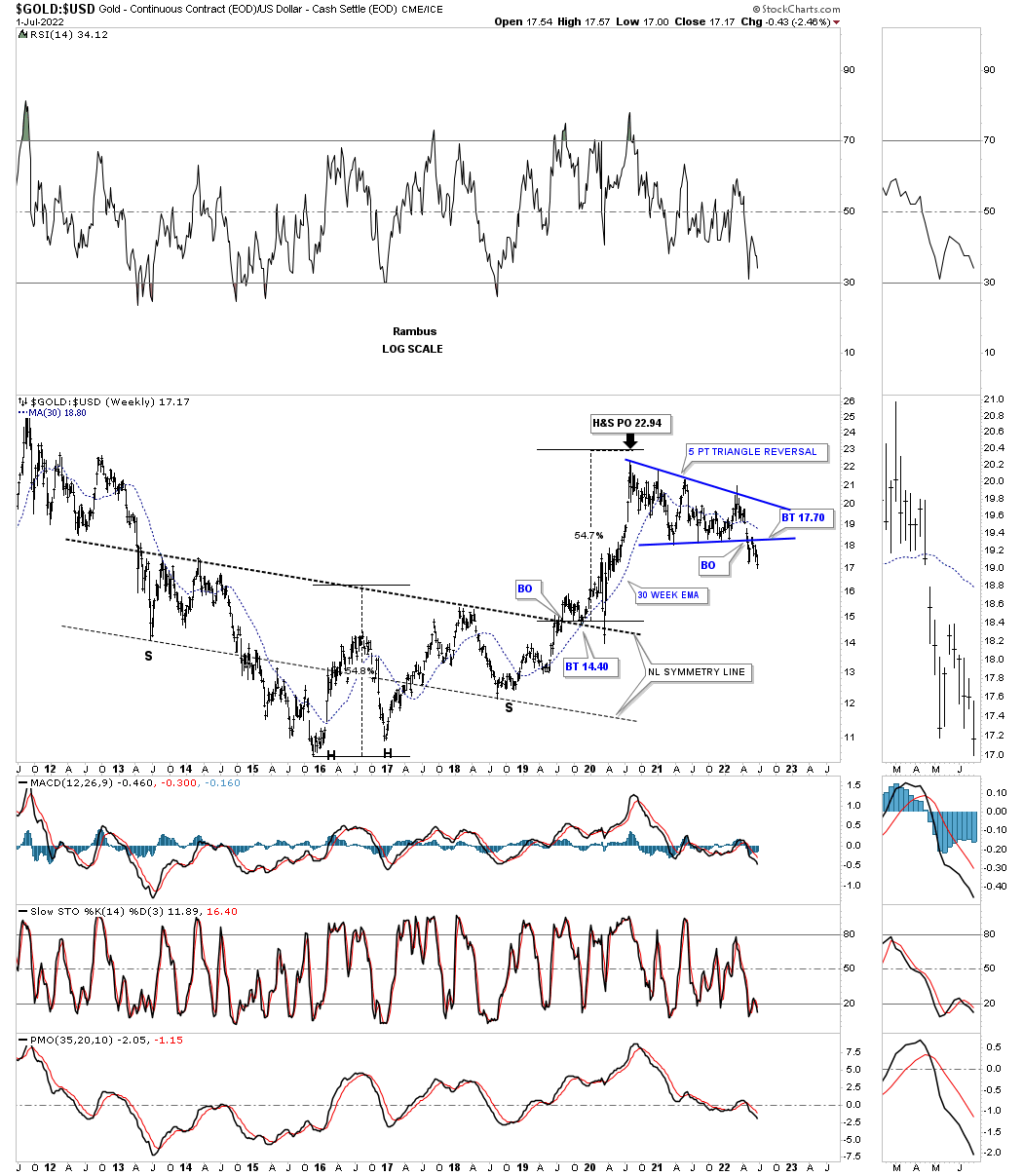
July 17th: The ratio continues lower after completing the backtest.
Everyone who follows the Gold:Silver ratio has their own interpretation of what it means. For me when the ratio is rising that is generally, but not always, not a good time to be in PM stocks. Since the 2020 low in the ratio and the high in the PM complex the ratio has broken back above 80 which is not a bullish sign if one is long the PM complex. Again, it is not the end of the world, but a huge warning sign to stay vigilant if one is thinking about entering the PM complex.
July 4th:
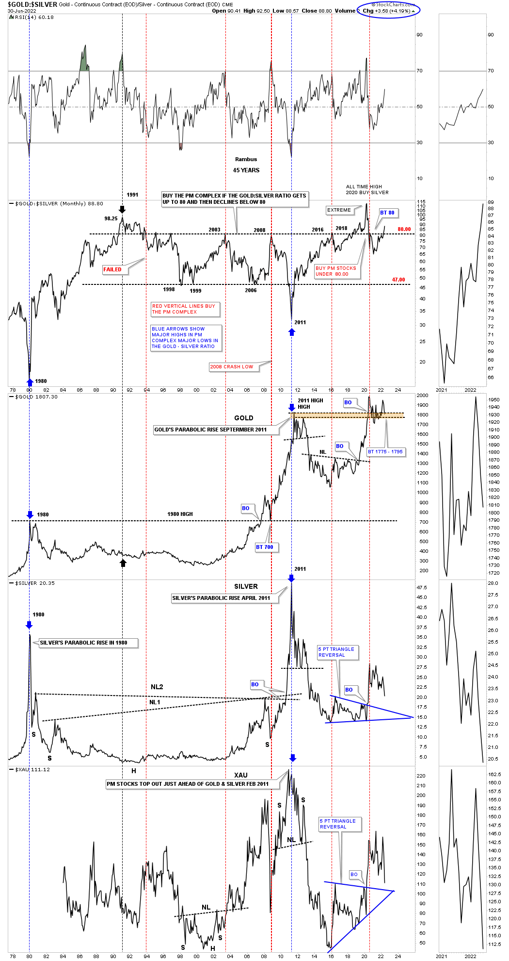
July 17th: Still moving in the wrong direction.
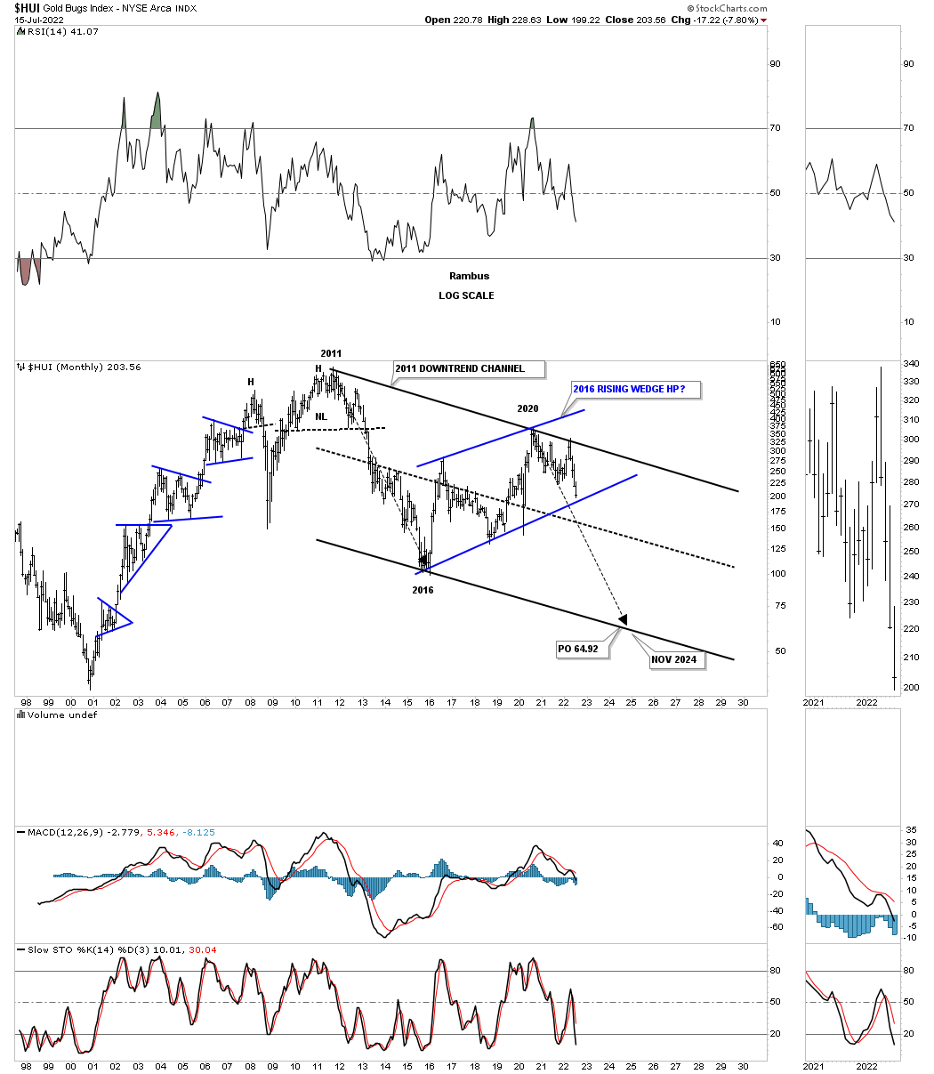
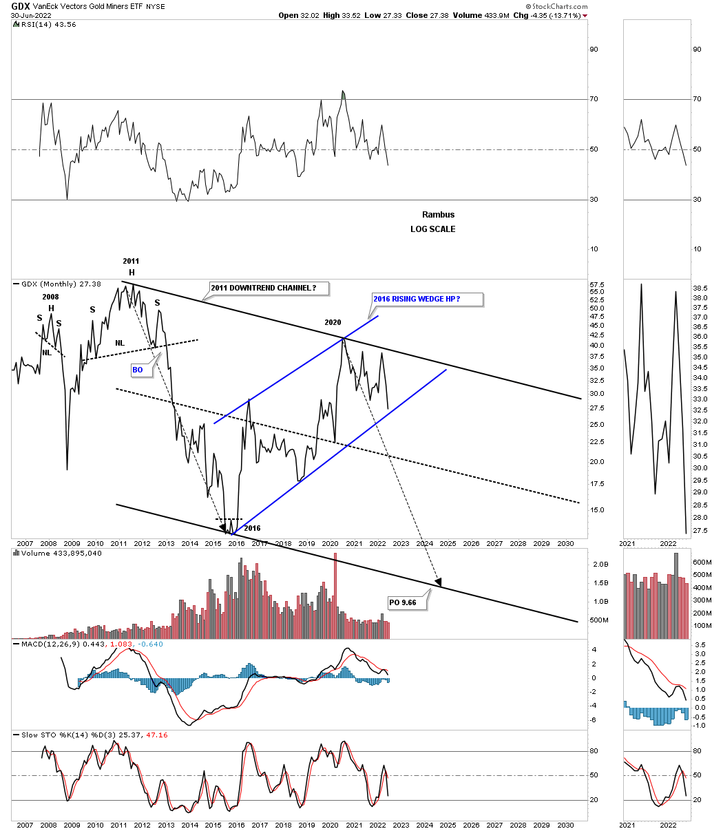
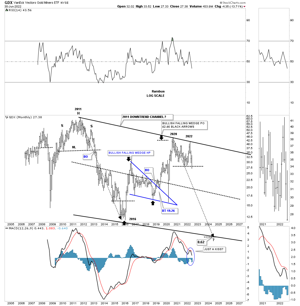
Lets look at a few PM stock indexes to see if they can give us any good clues on the next important direction for the PM stocks. Lets start with the long term monthly chart for the HUI which shows its 2000 bull market uptrend channel. The two black rectangles measure each half of the uptrend channel. The HUI could decline down to the bottom rail and the bull market would still be intact with no damage done, frustrating the bulls.
July 4th:
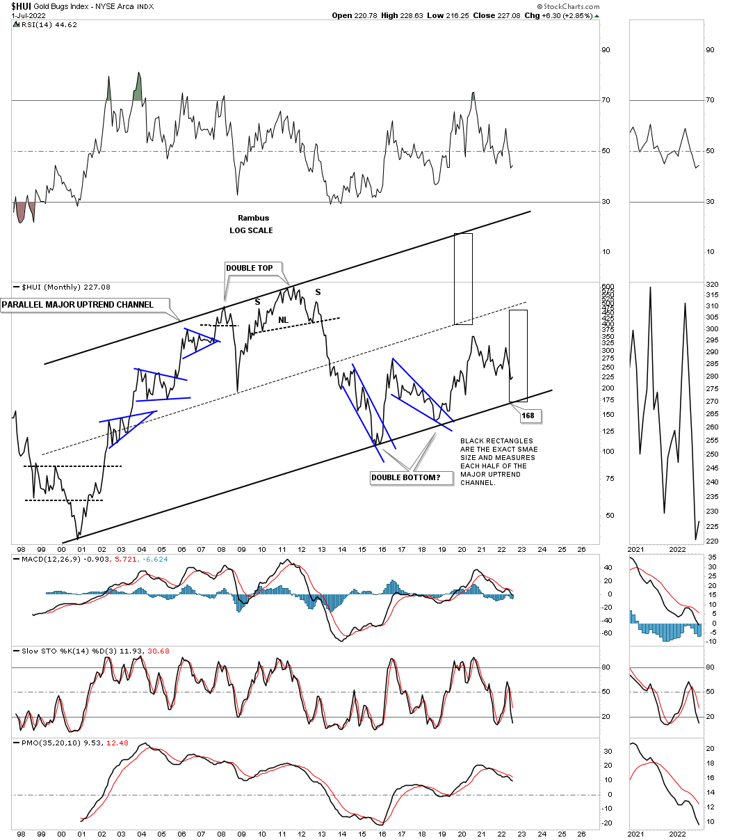
July 17th: Bottom rail of the 2000 bull market coming into focus.
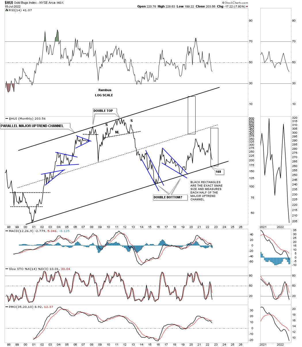
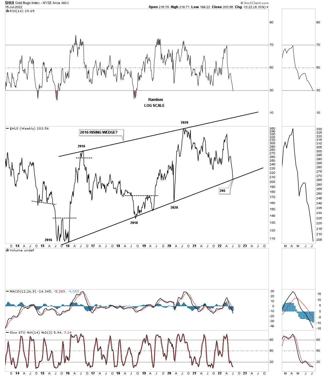
And then there is another possibility that few are even aware of which is the possible 2016 rising wedge formation. As you can see each important reversal point comes at an important top or bottom in the past five years or so. A touch of the bottom rail will complete the all important 4th reversal point in the rising wedge and is where the bulls need to step up and hold support. If they fail to do so the rising wedge will then be a consolidation pattern to the downside.
July 4th:
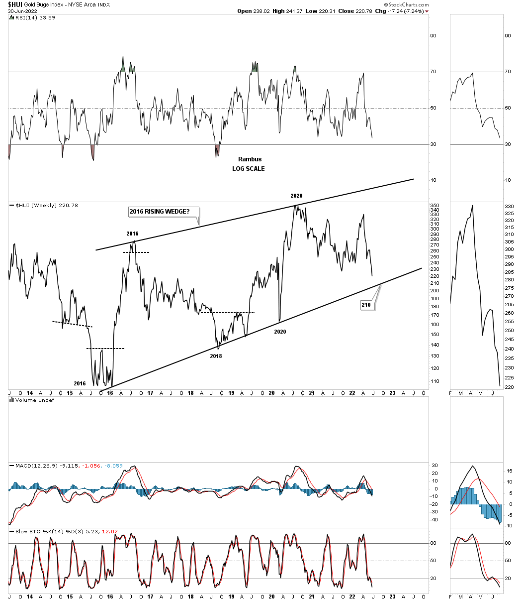
July 17th: The bottom rail was hit this week completing the 4th reversal point.
This longer term bar chart for the HUI shows how the 2016 rising wedge would look as a halfway pattern if the bottom blue trendline is broken to the downside.
July 4th:
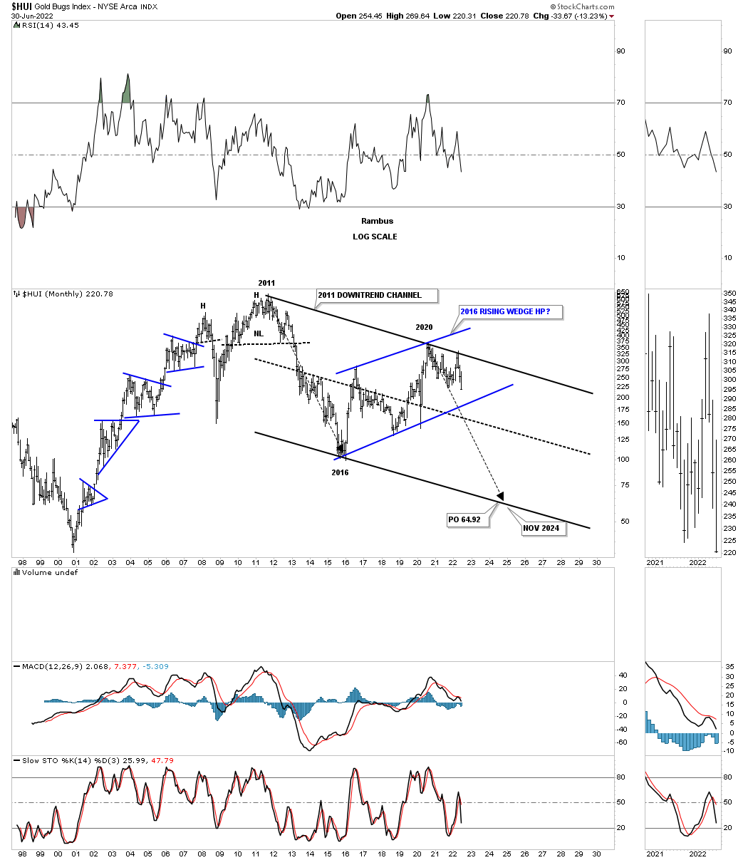
July 17th: Approaching bottom trendline.
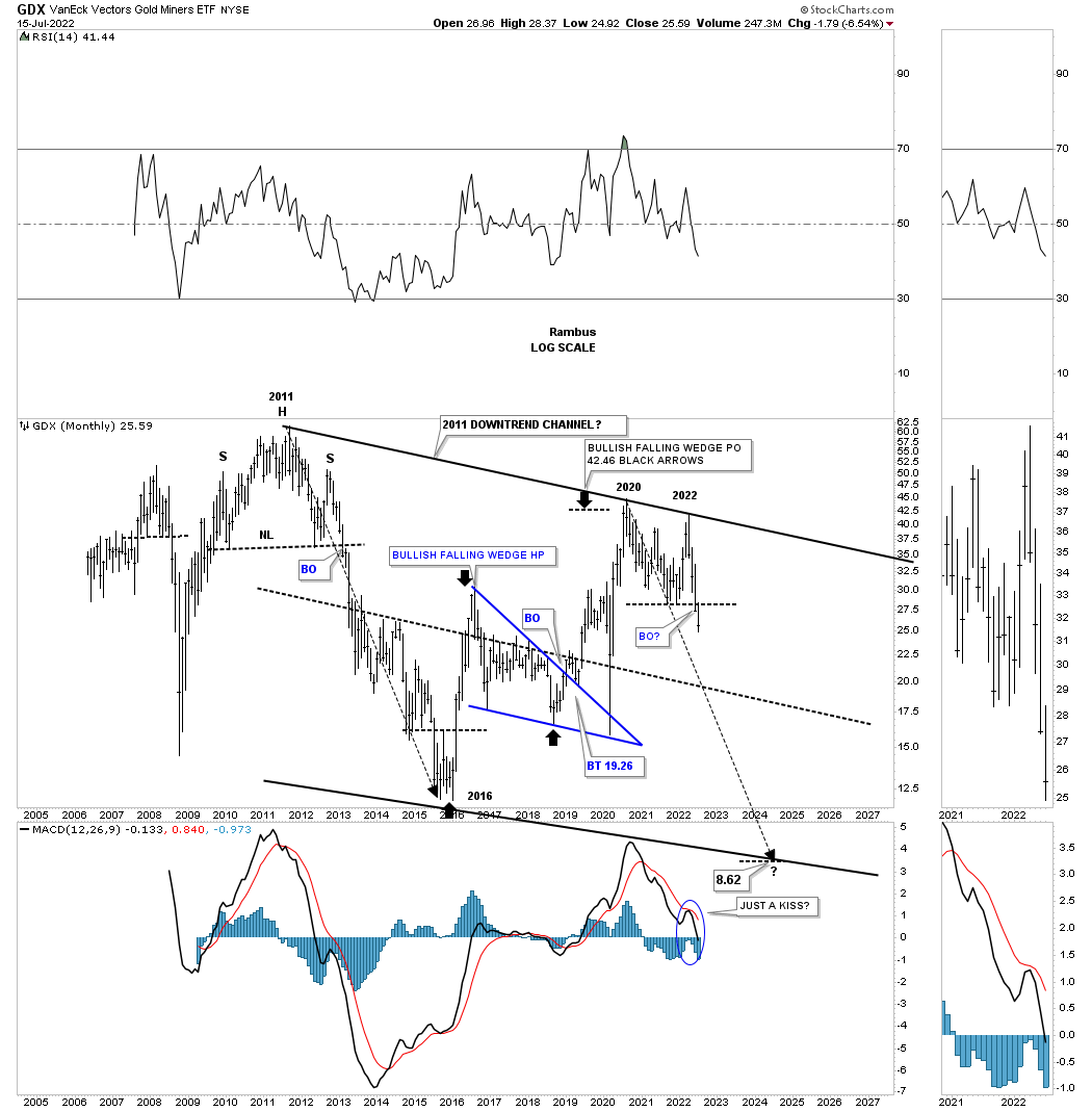
This monthly chart for the GDX shows the 2013 brown shaded S&R zone, which has been holding support since the 2020 high, with the price action closing last week below it. During a strong impulse move down you will generally see a string of black candlesticks all in a row, with the end of June showing the third. Just the opposite in a strong impulse move up where you will see a string of white candlesticks.
July 4th:
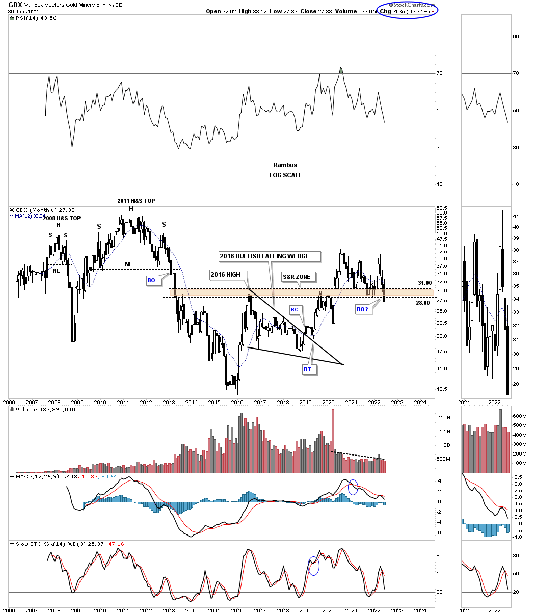
July 17th: Clearly trading below the browns shaded S&R zone with another black candlestick. Above is bullish and below is bearish. Keeping it simple.
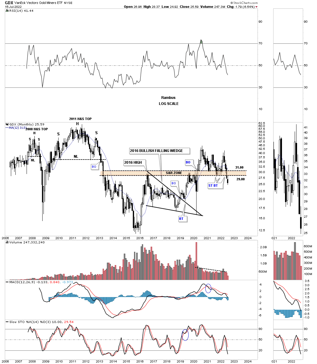
This next monthly chart for the GDX shows the price action hitting critical support last week where the bottom rail of the 2016 uptrend channel and the bottom rail of the possible blue bull flag intersect. The possible blue flag won’t be complete until the top rail is broken to the upside leaving the bulls with a lot of work on their hands if the 2016 trading range is going to be bullish. On the other hand if the bottom rail of the 2016 uptrend channel and the bottom rail of the possible blue bull flag give way then we’ll be left with a bearish rising channel.
July 4th:
July 17th: The critical area of support is now broken.
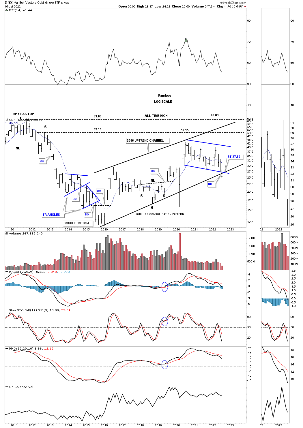
This monthly line chart shows how the blue rising channel would look in the 2011 downtrend channel as a possible halfway pattern to the downside.
July 4th:
July 17th: We’ll have to wait for the end of the month to know it the breakout is still holding.
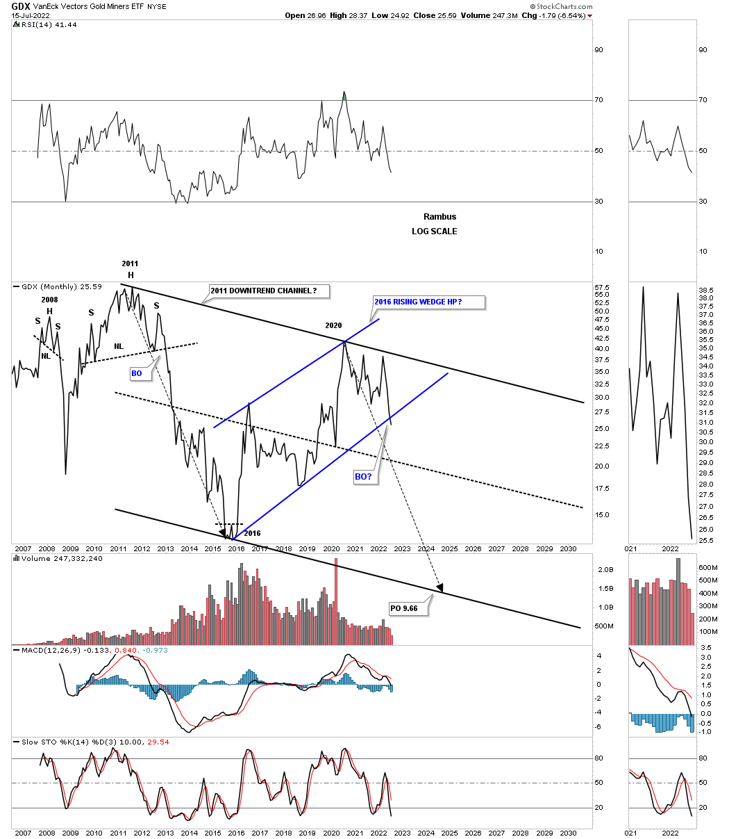
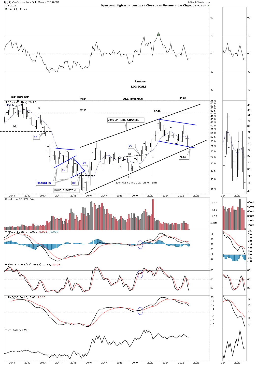
The monthly bar chart for the GDX.
July 4th:
July 17th: A new lower monthly low.
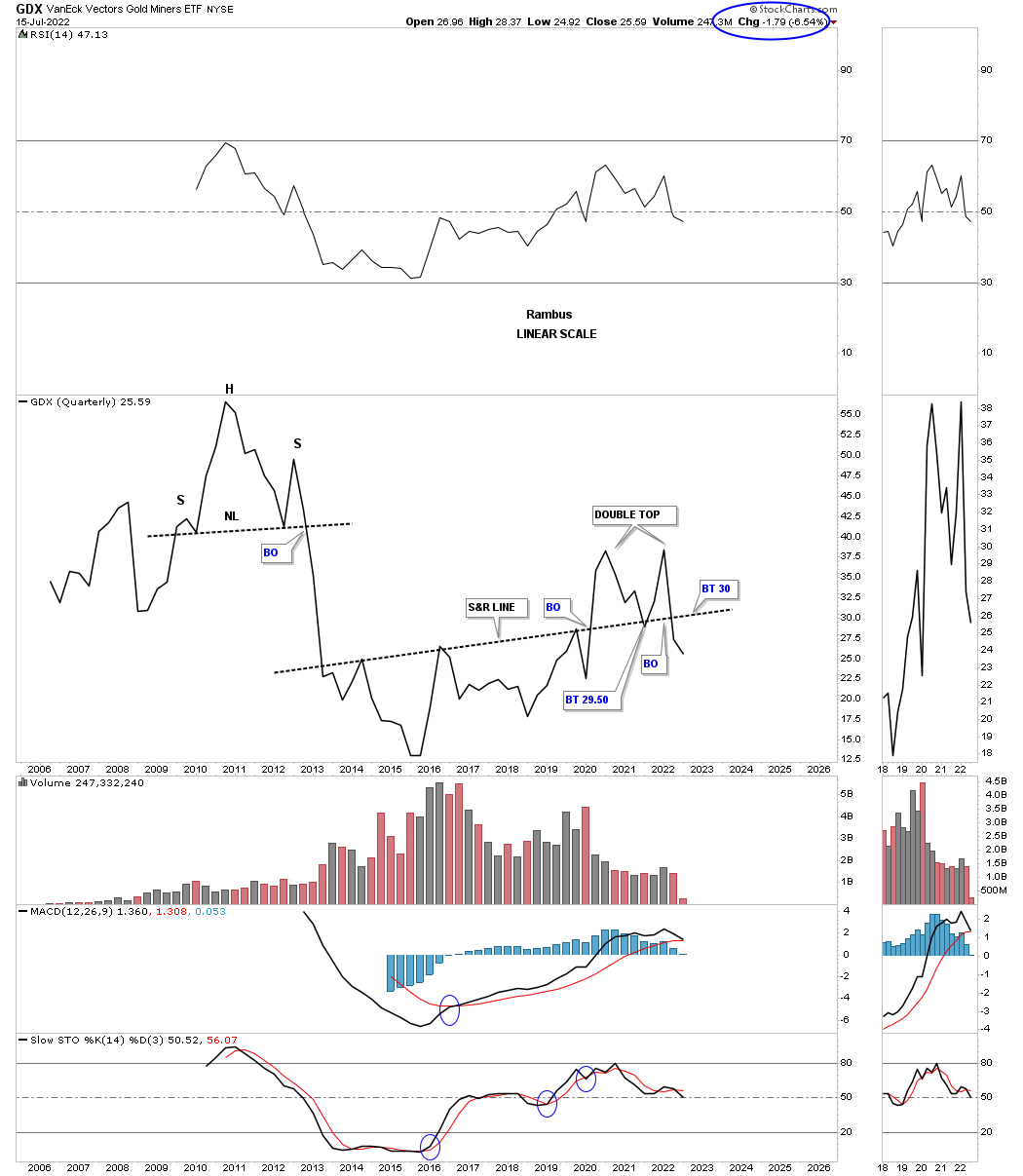
Something happened this quarter that I wasn’t excepting when the 2nd quarter began. This quarterly line chart for the GDX shows the price action closing the quarter below the S&R line going all the way back to 2013. I’ve been following that S&R line for many years and to see it give way like that was very interesting. As you can see I’ve labeled the price action above it as a double top reversal pattern which I have to admit I wasn’t expecting when the quarter began three months ago.
July 4th:
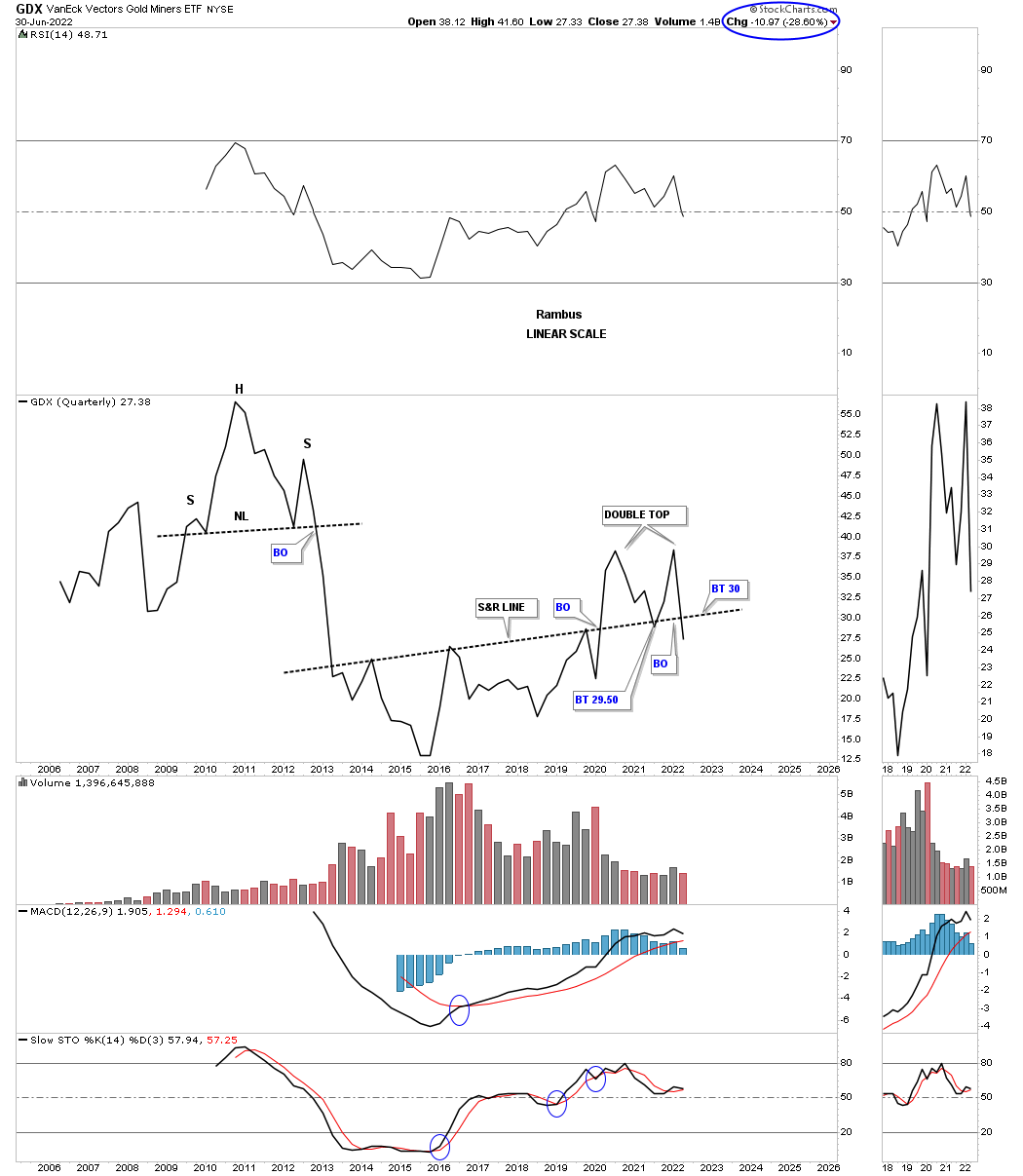
July 17th: The quarter is still young.
I’ve been mentioning for quite sometime that Silver and the GDXJ have been the weakest areas in the PM complex. This monthly line chart for the GDXJ, junior miners, closed the month of June below the bottom rail of its 2016 rising wedge formation. Now we’ll see if the bottom rail can hold resistance on the backtest.
July 4th:

July 17th: Still in breakout mode.
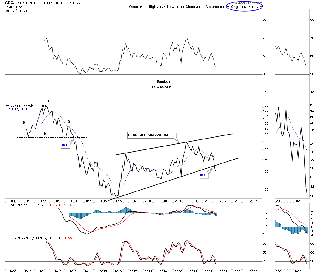
This history chart for the GDXJ shows how the 2016 rising wedge fits into the very big picture. Again, now we’ll see if the backtest can hold resistance.
July 4th:
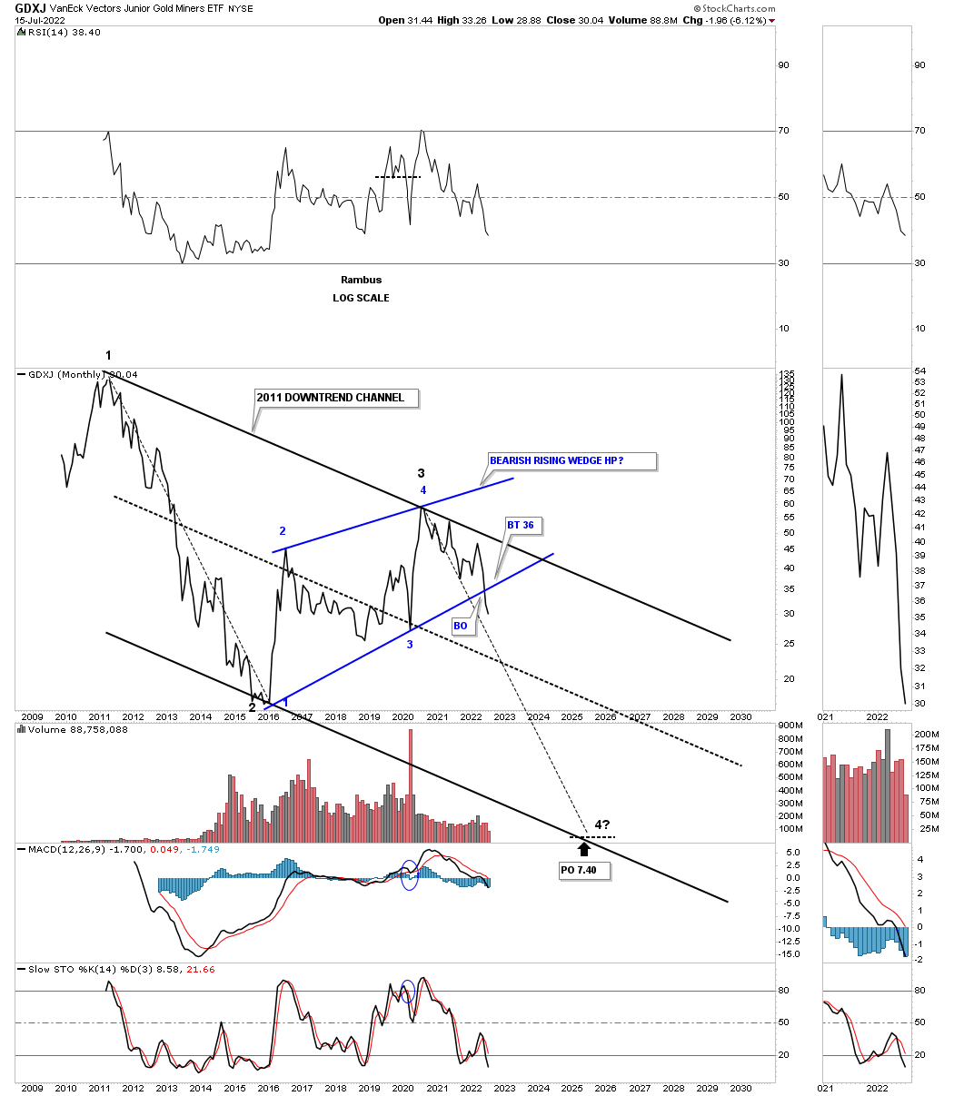
July 17th: Still in breakout mode.

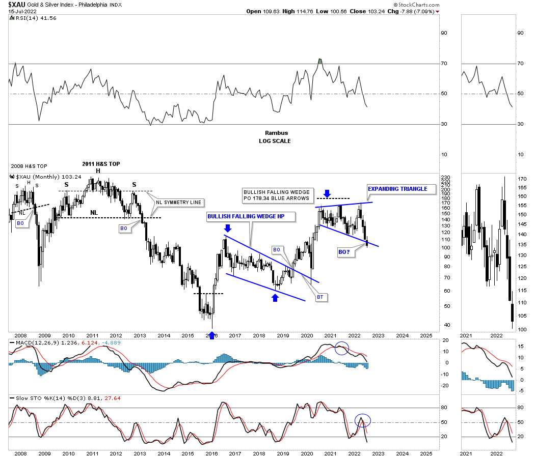
The XAU is one of the older PM stock indexes and is still finding support on the bottom rail of its 2020 expanding triangle, which has completed five reversal points putting it into the reversal pattern to the downside category if the bottom rail fails to hold support. So again, it is time for the bulls to hold support and show they are strong and mean business.
July 4th:
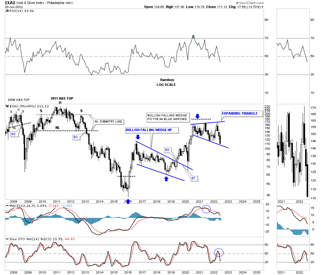
July 17th: Where are the bulls?
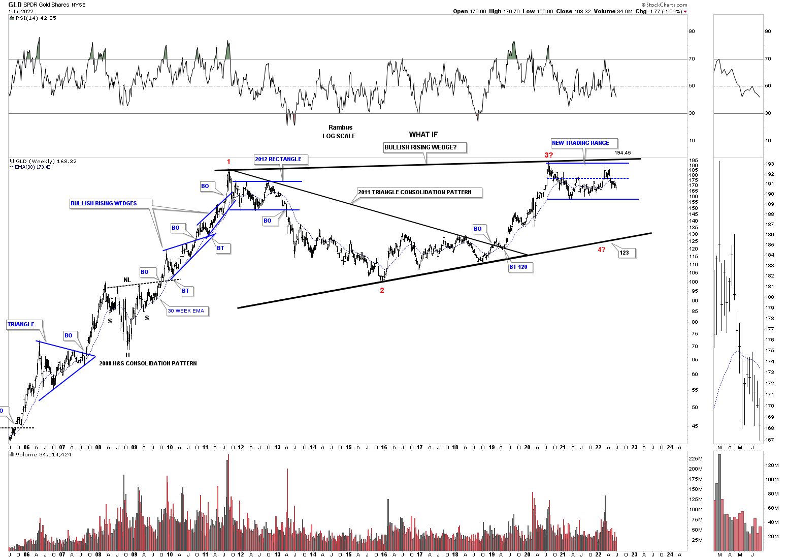
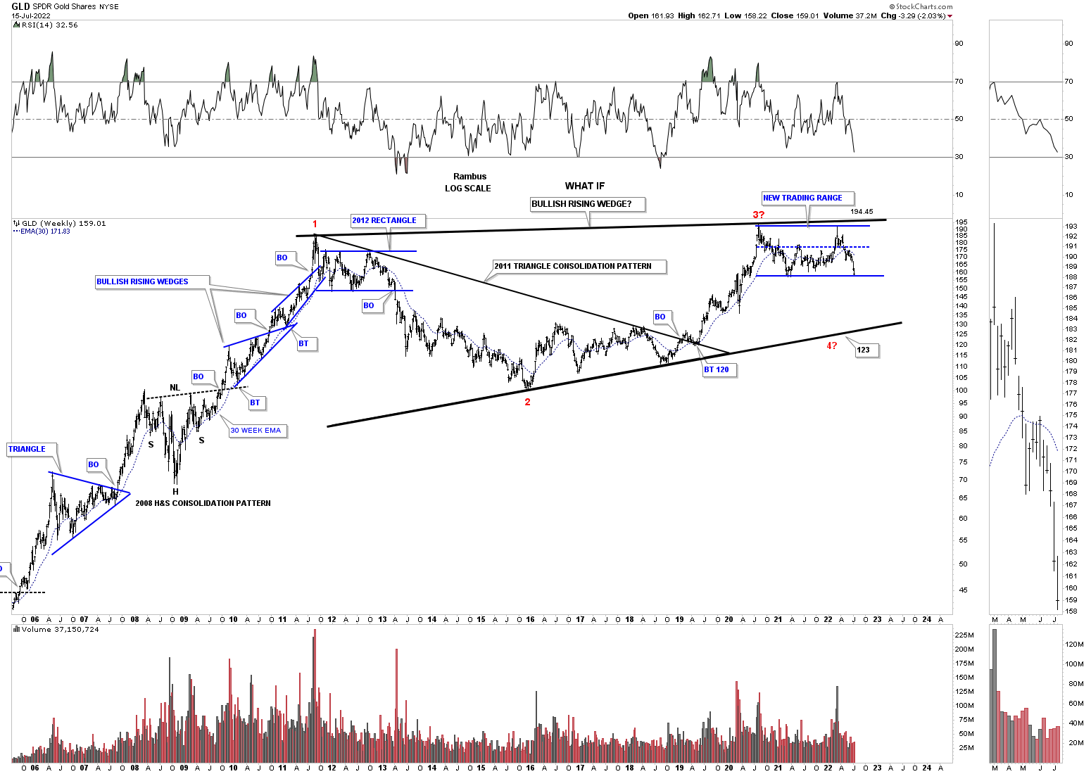
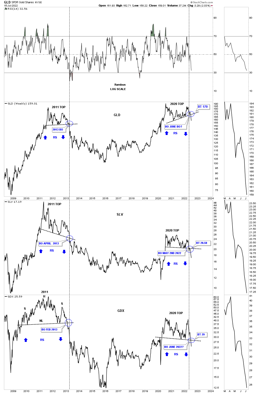
This next chart I believe is the most important chart for letting us know if a big move down is a possibility. This triple combo chart has GLD on top with SLV in the middle and the GDX on the bottom. What this combo chart is showing us is the potential for a massive double top with the 2011 high on the left side of the chart and the 2020 high on the right side.
The blue circles show the breakout points in 2011 below the black dashed S&R lines. Looking at the GDX you can see it broke below its neckline before GLD and SLV by several months. GLD and SLV broke below their S&R lines at the same time, black dashed vertical line.
The last time we looked at this triple combo chart GLD was trading well above its 2020 S&R line, but is now touching it. SLV on the other hand had already broken below its S&R line and completed the backtest before making a lower low last week. Will SLV be leading the breakout to the downside this time like the GDX did back in 2013? We should find out in the not too distant future.
There are a lot of analysts that are looking at the 2011 and 2020 highs as a big cup and handle formation that is going to send the PM stocks into the stratosphere. What this triple combo chart is strongly suggesting is that the PM complex could very well be putting in a major top like in 2011. You can see how fast the price action fell when the 2011 S&R line gave way which didn’t let anyone out to save their portfolio until it was too late.
Another thing that could make the possible impulse move to the downside so intense is the vertical rally out of the 2020 crash low. If there was ever a place to see some reverse symmetry to the downside this would be it especially on the initial thrust which will catch most investors off guard. I pointed out that possibility back in 2013 when the tops gave way to the downside as shown by the blue arrows.
July 4th:
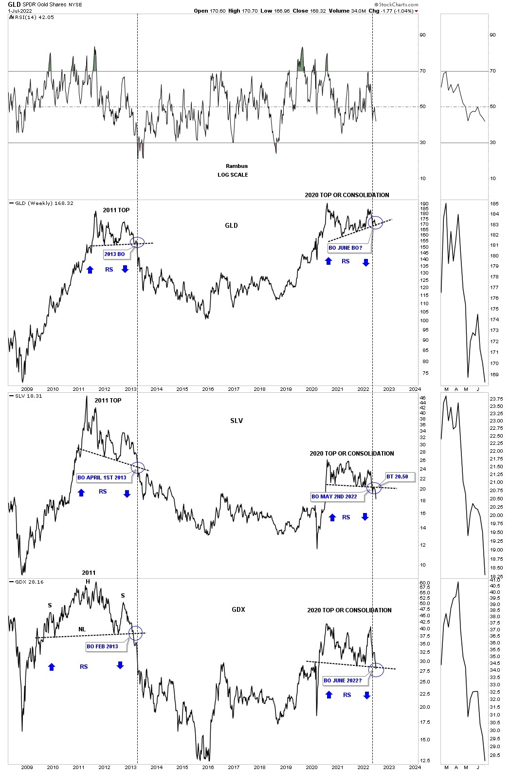
July 17th: All three have now broken to the downside reversing symmetry, blue arrows. Has the bull trap been sprung?
To really put what the charts above are strongly suggesting, below are many individual PM stocks showing what they think could happen. I have no reason from the fundamental point of view of why the PM stocks would move lower at this point in time, but it will become crystal clear when we look back in time.
All the charts below are pretty self explanatory and should make it pretty clear of what is about to happen in regards to many of the PM stocks. Until something important changes, my game plan is to follow these charts with a clear and open mind.
Enjoy the 4th of July tomorrow. All the best…Rambus
July 17th: I’m just going to post a few of the PM stocks from the original Weekend Report. To really understand what is happening in the PM stock indexes it is important to look at the individual stocks that makeup the indexes. All the best…Rambus
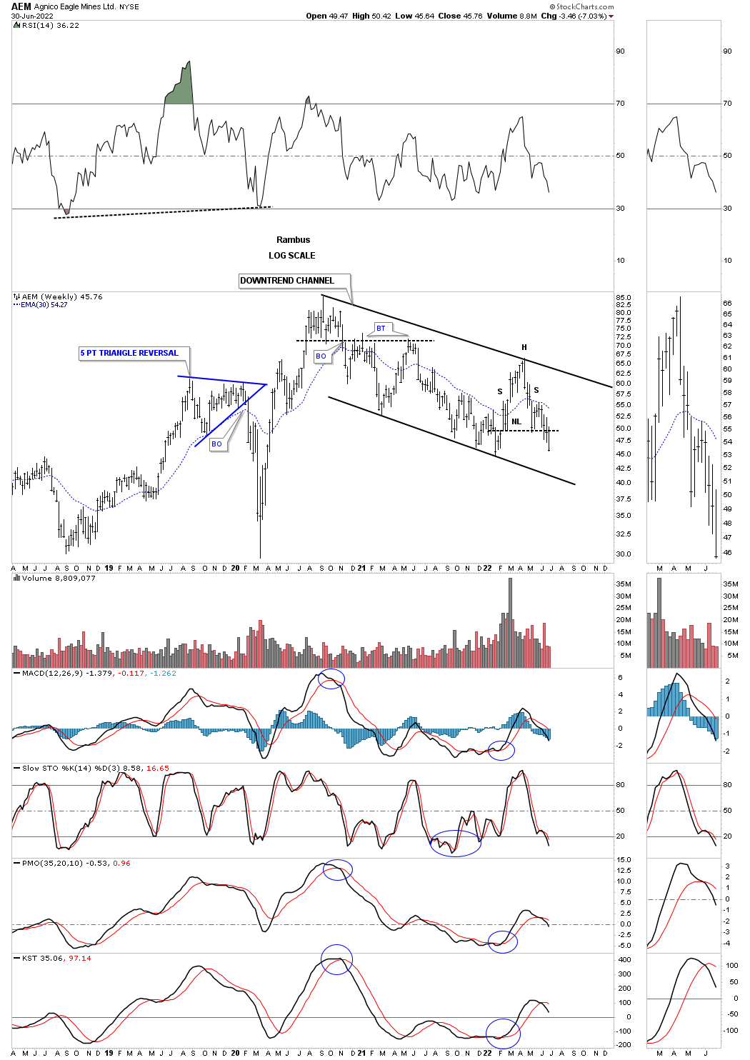
July 4th: AEM weekly:
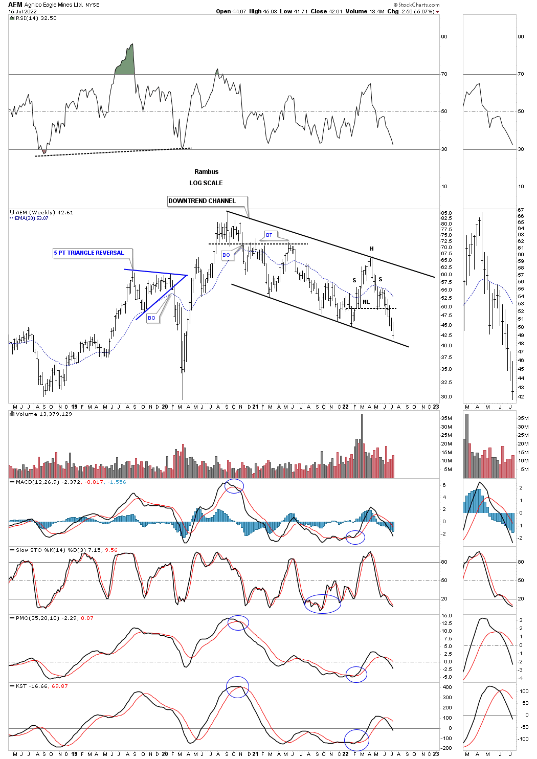
July 17th:
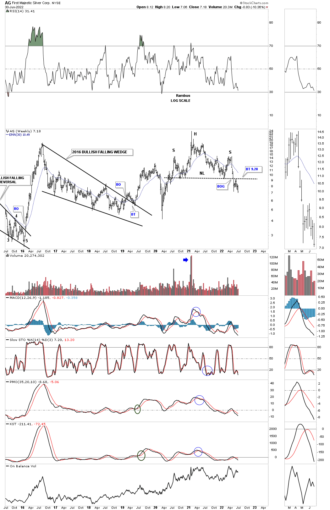
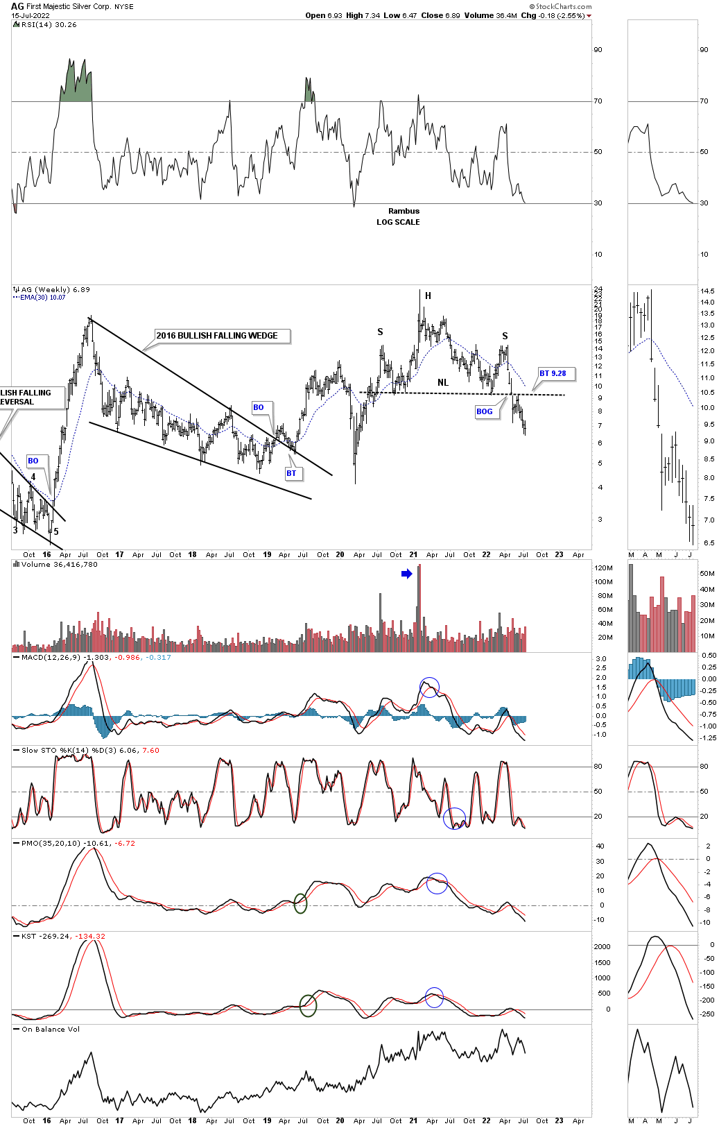
July 4th: AG weekly:
July 17th:
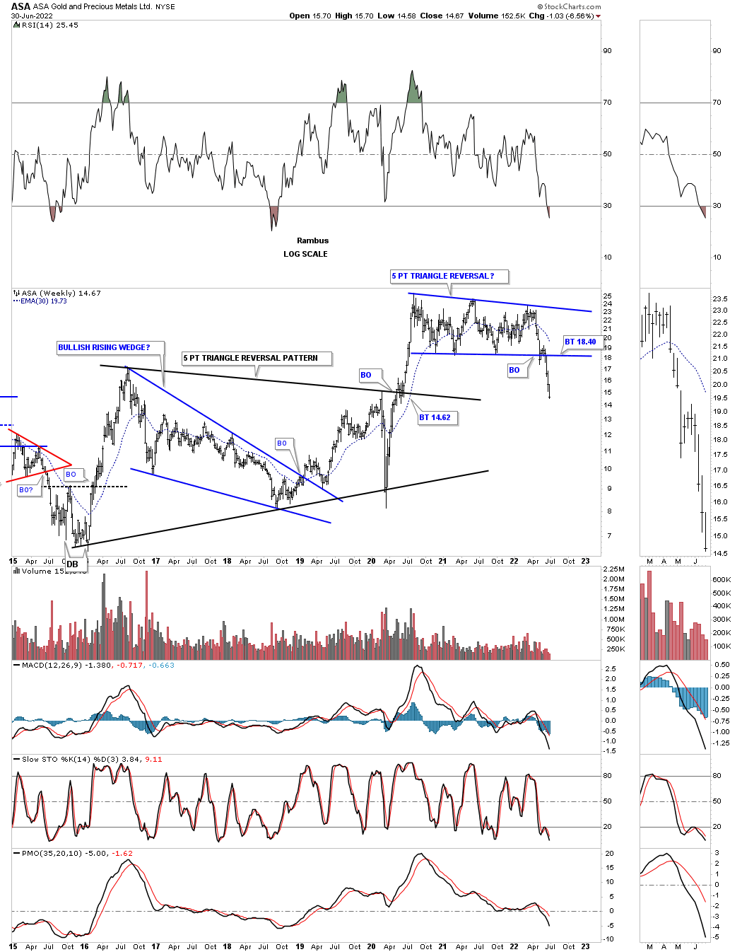
July 4th: ASA weekly.
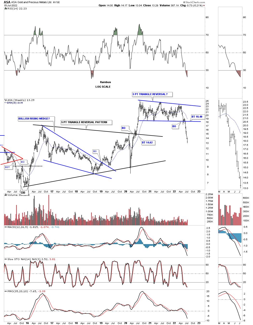
July 17th ASA weekly: Reversing symmetry to the downside.
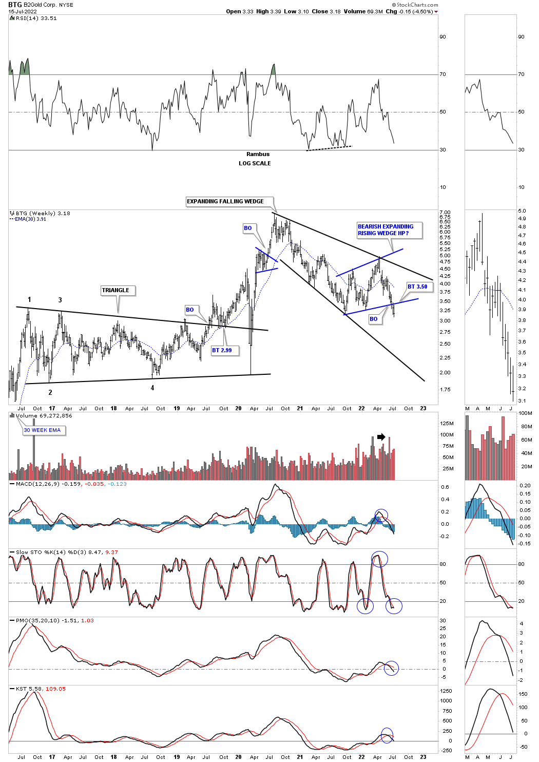
July 17th BTG weekly: A touch of the bottom rail of the 2020 black expanding falling wedge might be a good place to get positioned.
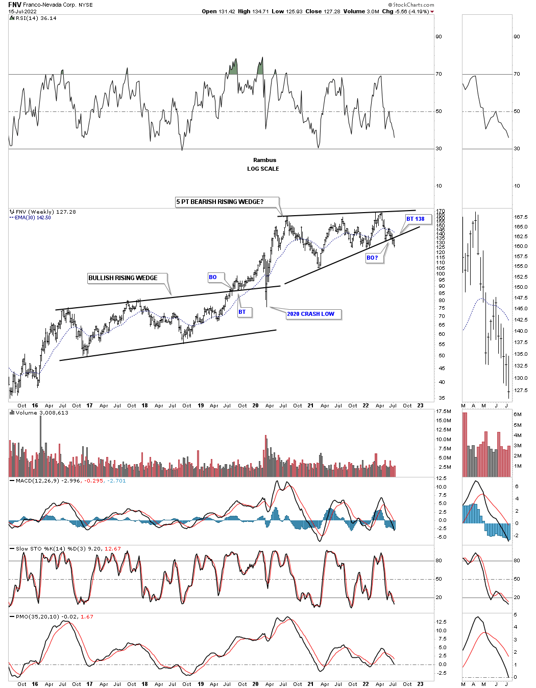
July 17th FNV weekly: Five point bearish rising wedge.
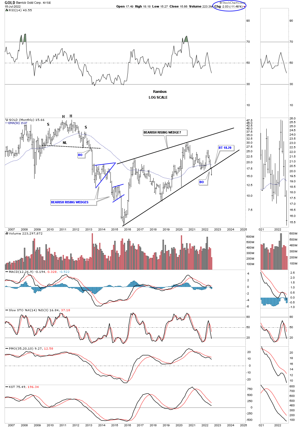
July 17th ABX monthly: Bearish rising wedge.
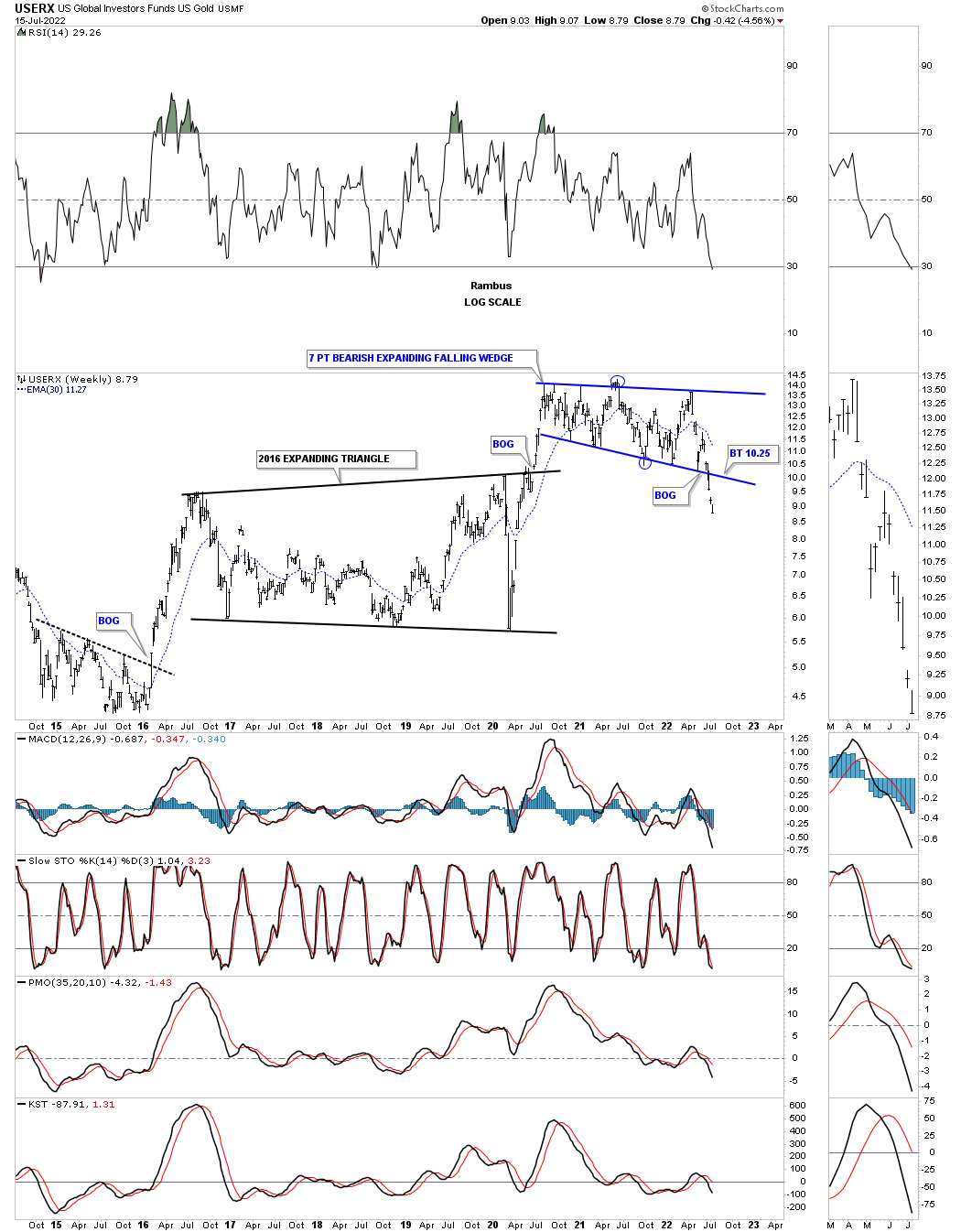
July 17th USERX weekly: Bearish expanding falling wedge.
Related Reading:
- Rambus: Blockbuster Chartology – May, 2022
- Rambus: Blockbuster Chartology – February, 2022
- Rambus: Blockbuster Chartology – October, 2021
- Rambus: Blockbuster Chartology – July, 2021
- Rambus: Blockbuster Chartology – April, 2021
- Rambus: Blockbuster Chartology – January, 2021
- Rambus: Blockbuster Chartology – October, 2020
- Rambus: Blockbuster Chartology – July, 2020
- Rambus: Blockbuster Chartology – May, 2020
- Rambus: Blockbuster Chartology – January, 2020
- Rambus: Blockbuster Chartology – October, 2019
- Rambus: Blockbuster Chartology – July, 2019
- Rambus: Blockbuster Chartology – April, 2019
- Rambus: Blockbuster Chartology – January, 2019
- Rambus: Blockbuster Chartology – October, 2018
- Rambus: Blockbuster Chartology – July, 2018
- Rambus: Blockbuster Chartology – April, 2018
- 2017 Annual Wrap Up – Does Your Pension Fund Have A Deep State Drain? – January, 2018
- 1st Quarter Wrap Up 2018 Web Presentation
- Blockbuster Chartology with Rambus – October, 2017
- Blockbuster Chartology with Rambus – July, 2017
- Blockbuster Chartology with Rambus – May, 2017
- Blockbuster Chartology with Rambus – January, 2017
- Blockbuster Chartology with Rambus – October 20, 2016
- Blockbuster Chartology with Rambus – July 21, 2016
- Blockbuster Chartology with Rambus – April 21, 2016
- Rambus: Are We in a Deflationary Spiral? – January 28, 2016
- The Dollar, Gold & the S&P 500 with Rambus – October 15, 2015